
1. مقدمة
تساعد Material Components (MDC) المطوّرين في تنفيذ التصميم المتعدد الأبعاد. تم إنشاء MDC بواسطة فريق من المهندسين ومصممي تجربة المستخدم في Google، وتتضمّن عشرات المكوّنات الجميلة والوظيفية لواجهة المستخدم، وهي متاحة على Android وiOS والويب وFlutter.material.io/develop |
في الدرسَين العمليَّين MDC-101 وMDC-102، استخدَمت Material Components (MDC) لإنشاء أساسيات تطبيق باسم Shrine، وهو تطبيق للتجارة الإلكترونية يبيع الملابس والسلع المنزلية. يحتوي هذا التطبيق على مسار مستخدم يبدأ بشاشة تسجيل الدخول وينقل المستخدم إلى شاشة رئيسية تعرض المنتجات.
يمنح التوسّع الأخير في التصميم المتعدد الأبعاد المصمّمين والمطوّرين مرونة أكبر للتعبير عن العلامة التجارية لمنتجاتهم. يمكنك الآن استخدام MDC لتخصيص تطبيق Shrine وعرض تصميمه الفريد بشكل أفضل من أي وقت مضى.
ما ستنشئه
في هذا الدرس التطبيقي، ستخصّص تطبيق Shrine ليعكس علامته التجارية باستخدام:
- اللون
- فن الطباعة
- الارتفاع
- التنسيق


مكوّنات Android وأنظمة MDC الفرعية المستخدَمة في هذا الدرس التطبيقي حول الترميز
- المظاهر
- فن الطباعة
- الارتفاع
المتطلبات
- معرفة أساسية بتطوير تطبيقات Android
- استوديو Android (يمكنك تنزيله من هنا إذا لم يكن مثبّتًا لديك)
- محاكي Android أو جهاز Android (متاح من خلال استوديو Android)
- الرمز النموذجي (راجِع الخطوة التالية)
ما هو تقييمك لمستوى خبرتك في إنشاء تطبيقات Android؟
2. إعداد بيئة التطوير
هل سبق لك المشاركة في دورة MDC-102؟
إذا أكملت MDC-102، من المفترض أن يكون الرمز جاهزًا للاستخدام في هذا الدرس التطبيقي حول الترميز. انتقِل إلى الخطوة 3: تغيير اللون.
تنزيل تطبيق الدرس التطبيقي الأوّلي
يقع تطبيق البداية في دليل material-components-android-codelabs-103-starter/java. احرص على cd في هذا الدليل قبل البدء.
...أو استنسِخه من GitHub
لاستنساخ هذا الدرس التطبيقي من GitHub، شغِّل الأوامر التالية:
git clone https://github.com/material-components/material-components-android-codelabs
cd material-components-android-codelabs/
git checkout 103-starter
تحميل رمز البداية في "استوديو Android"
- بعد انتهاء معالج الإعداد وظهور النافذة مرحبًا بك في "استوديو Android"، انقر على فتح مشروع حالي في "استوديو Android". انتقِل إلى الدليل الذي ثبّت فيه الرمز النموذجي، واختَر java -> shrine (أو ابحث عن shrine على جهاز الكمبيوتر) لفتح مشروع Shrine.
- انتظِر لحظة إلى أن ينتهي "استوديو Android" من إنشاء المشروع ومزامنته، كما هو موضّح من خلال مؤشرات النشاط في أسفل نافذة "استوديو Android".
- في هذه المرحلة، قد يعرض "استوديو Android" بعض أخطاء الإنشاء لأنّك لم تثبِّت حزمة تطوير البرامج (SDK) لنظام التشغيل Android أو أدوات الإنشاء، مثل الخطأ الموضّح أدناه. اتّبِع التعليمات الواردة في "استوديو Android" لتثبيت/تعديل هذه الحزم ومزامنة مشروعك.

إضافة تبعيات المشروع
يحتاج المشروع إلى تبعية على مكتبة دعم MDC لنظام التشغيل Android. من المفترض أنّ الرمز النموذجي الذي نزّلته يتضمّن هذه التبعية، ولكن من الأفضل اتّباع الخطوات التالية للتأكّد من ذلك.
- انتقِل إلى ملف
build.gradleالخاص بالوحدةappوتأكَّد من أنّ الوحدةdependenciesتتضمّن اعتمادية على MDC Android:
api 'com.google.android.material:material:1.1.0-alpha06'
- (اختياري) إذا لزم الأمر، عدِّل ملف
build.gradleلإضافة التبعيات التالية ومزامنة المشروع.
dependencies {
    api 'com.google.android.material:material:1.1.0-alpha06'
    implementation 'androidx.legacy:legacy-support-v4:1.0.0'
    implementation 'com.android.volley:volley:1.1.1'
    implementation 'com.google.code.gson:gson:2.8.5'
    implementation "org.jetbrains.kotlin:kotlin-stdlib-jdk7:1.3.21"
    testImplementation 'junit:junit:4.12'
    androidTestImplementation 'androidx.test:core:1.1.0'
    androidTestImplementation 'androidx.test.ext:junit:1.1.0'
    androidTestImplementation 'androidx.test:runner:1.2.0-alpha05'
    androidTestImplementation 'androidx.test.espresso:espresso-core:3.2.0-alpha05'
}
تشغيل تطبيق المبتدئين
|

اكتمال النقل بنجاح من المفترض أن تظهر لك صفحة تسجيل الدخول إلى Shrine على جهازك أو المحاكي. عند الضغط على "التالي"، ستظهر صفحة Shrine الرئيسية مع شريط تطبيق في الأعلى وشبكة من صور المنتجات في الأسفل.

لنبدأ بتعديل شريط التطبيق العلوي ليتوافق مع العلامة التجارية Shrine من خلال تغيير لونه وارتفاعه وأسلوب الخط.
3- تغيير اللون
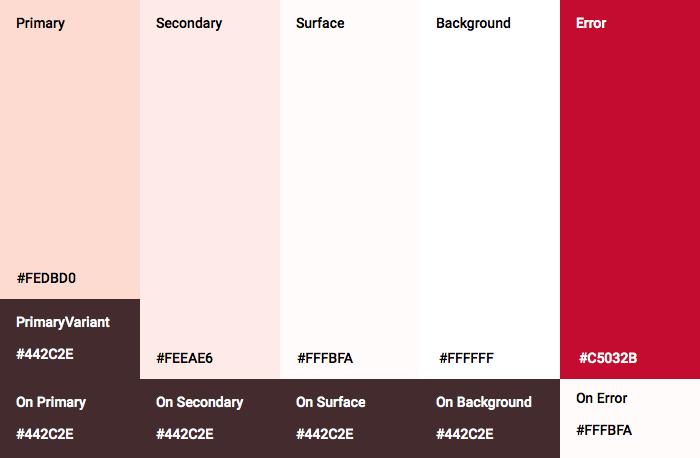
تم إنشاء نسق الألوان هذا بواسطة مُصمِّم باستخدام ألوان مخصّصة (موضّحة في الصورة أدناه). يحتوي على ألوان تم اختيارها من علامة Shrine التجارية وتم تطبيقها على أداة Material Theme Editor، ما أدّى إلى توسيعها لإنشاء لوحة ألوان أكثر اكتمالاً. (هذه الألوان ليست من لوحات ألوان Material لعام 2014).
نظَّم تطبيق Material Theme Editor هذه الألوان في درجات مظلّلة تحمل أرقامًا، بما في ذلك التصنيفات 50 و100 و200 و... إلى 900 لكل لون. يستخدم Shrine الدرجات 50 و100 و300 من عيّنة اللون الوردي والدرجة 900 من عيّنة اللون البني فقط.

لنغيّر لون شريط التطبيق العلوي ليعكس نظام الألوان هذا.
ضبط colorPrimaryDark وcolorAccent
في colors.xml، عدِّل الأسطر التالية. تتحكّم السمة colorAccent في لون شريط التطبيق العلوي، من بين أمور أخرى، وتتحكّم السمة colorPrimaryDark في لون شريط الحالة.
colors.xml
<color name="colorPrimaryDark">#FBB8AC</color>
<color name="colorAccent">#FEDBD0</color>
لاستخدام الرموز الداكنة في شريط الحالة، أضِف ما يلي إلى Theme.Shrine، مظهر تطبيق Shrine:
styles.xml
<item name="android:windowLightStatusBar" tools:targetApi="m">true</item>
يجب أن يظهر colors.xml وstyles.xml على النحو التالي:
colors.xml
<?xml version="1.0" encoding="utf-8"?>
<resources>
   <color name="colorPrimary">#E0E0E0</color>
   <color name="colorPrimaryDark">#FBB8AC</color>
   <color name="colorAccent">#FEDBD0</color>
   <color name="toolbarIconColor">#FFFFFF</color>
   <color name="loginPageBackgroundColor">#FFFFFF</color>
   <color name="productGridBackgroundColor">#FFFFFF</color>
</resources>
styles.xml
<resources xmlns:android="http://schemas.android.com/tools">

   <!-- Base application theme. -->
   <style name="Theme.Shrine" parent="Theme.MaterialComponents.Light.NoActionBar">
       <!-- Customize your theme here. -->
       <item name="colorPrimary">@color/colorPrimary</item>
       <item name="colorPrimaryDark">@color/colorPrimaryDark</item>
       <item name="colorAccent">@color/colorAccent</item>
       <item name="android:windowLightStatusBar" tools:targetApi="m">true</item>
   </style>

   <style name="Widget.Shrine.Toolbar" parent="Widget.AppCompat.Toolbar">
       <item name="android:background">?attr/colorAccent</item>
       <item name="android:theme">@style/ThemeOverlay.AppCompat.Dark.ActionBar</item>
       <item name="popupTheme">@style/ThemeOverlay.AppCompat.Light</item>
   </style>

</resources>
في colors.xml، أضِف مجموعة موارد ألوان textColorPrimary جديدة إلى #442C2E، وعدِّل السمة toolbarIconColor للإشارة إلى لون textColorPrimary.
عدِّل ملف styles.xml لضبط سمة android:textColorPrimary على اللون textColorPrimary.
سيؤدي ضبط android:textColorPrimary في Theme.Shrine إلى تنسيق النص في جميع العناصر، بما في ذلك شريط التطبيق العلوي والرموز في شريط التطبيق العلوي.
هناك خطوة أخرى: اضبط السمة android:theme في نمط Widget.Shrine.Toolbar على Theme.Shrine.
يجب أن يظهر colors.xml وstyles.xml على النحو التالي:
colors.xml
<?xml version="1.0" encoding="utf-8"?>
<resources>
   <color name="colorPrimary">#E0E0E0</color>
   <color name="colorPrimaryDark">#FBB8AC</color>
   <color name="colorAccent">#FEDBD0</color>
   <color name="textColorPrimary">#442C2E</color>
   <color name="toolbarIconColor">@color/textColorPrimary</color>
   <color name="loginPageBackgroundColor">#FFFFFF</color>
   <color name="productGridBackgroundColor">#FFFFFF</color>
</resources>
styles.xml
<resources xmlns:android="http://schemas.android.com/tools">

   <!-- Base application theme. -->
   <style name="Theme.Shrine" parent="Theme.MaterialComponents.Light.NoActionBar">
       <!-- Customize your theme here. -->
       <item name="colorPrimary">@color/colorPrimary</item>
       <item name="colorPrimaryDark">@color/colorPrimaryDark</item>
       <item name="colorAccent">@color/colorAccent</item>
       <item name="android:windowLightStatusBar" tools:targetApi="m">true</item>
       <item name="android:textColorPrimary">@color/textColorPrimary</item>
   </style>

   <style name="Widget.Shrine.Toolbar" parent="Widget.AppCompat.Toolbar">
       <item name="android:background">?attr/colorAccent</item>
       <item name="android:theme">@style/Theme.Shrine</item>
       <item name="popupTheme">@style/ThemeOverlay.AppCompat.Light</item>
   </style>

</resources>
البناء والتنفيذ يجب أن تبدو شبكة المنتجات الآن على النحو التالي:

لنغيّر نمط شاشة تسجيل الدخول ليتوافق مع نظام الألوان.
تنسيق الحقول النصية
لنغيّر مربّعات إدخال النص في صفحة تسجيل الدخول لتصبح محدّدة بخطوط خارجية ونستخدم ألوانًا أفضل للتصميم.
أضِف مورد اللون التالي إلى ملف colors.xml:
colors.xml
<color name="textInputOutlineColor">#FBB8AC</color>
أضِف نمطَين جديدَين في styles.xml:
styles.xml
<style name="Widget.Shrine.TextInputLayout" parent="Widget.MaterialComponents.TextInputLayout.OutlinedBox">
   <item name="hintTextAppearance">@style/TextAppearance.Shrine.TextInputLayout.HintText</item>
   <item name="hintTextColor">@color/textColorPrimary</item>
   <item name="android:paddingBottom">8dp</item>
   <item name="boxStrokeColor">@color/textInputOutlineColor</item>
</style>

<style name="TextAppearance.Shrine.TextInputLayout.HintText" parent="TextAppearance.MaterialComponents.Subtitle2">
   <item name="android:textColor">?android:attr/textColorPrimary</item>
</style>
أخيرًا، اضبط سمة النمط على كلتا مكوّنات XML TextInputLayout في shr_login_fragment.xml على النمط الجديد:
shr_login_fragment.xml
<com.google.android.material.textfield.TextInputLayout
   style="@style/Widget.Shrine.TextInputLayout"
   android:layout_width="match_parent"
   android:layout_height="wrap_content"
   android:hint="@string/shr_hint_username">

   <com.google.android.material.textfield.TextInputEditText
       android:layout_width="match_parent"
       android:layout_height="wrap_content"
       android:inputType="text"
       android:maxLines="1" />
</com.google.android.material.textfield.TextInputLayout>

<com.google.android.material.textfield.TextInputLayout
   android:id="@+id/password_text_input"
   style="@style/Widget.Shrine.TextInputLayout"
   android:layout_width="match_parent"
   android:layout_height="wrap_content"
   android:hint="@string/shr_hint_password"
   app:errorEnabled="true">

   <com.google.android.material.textfield.TextInputEditText
       android:id="@+id/password_edit_text"
       android:layout_width="match_parent"
       android:layout_height="wrap_content"
       android:inputType="textPassword" />
</com.google.android.material.textfield.TextInputLayout>
تحديد ألوان الأزرار
أخيرًا، حدِّد أنماط ألوان الأزرار في صفحة تسجيل الدخول. أضِف الأنماط التالية إلى styles.xml:
styles.xml
<style name="Widget.Shrine.Button" parent="Widget.MaterialComponents.Button">
   <item name="android:textColor">?android:attr/textColorPrimary</item>
   <item name="backgroundTint">?attr/colorPrimaryDark</item>
</style>

<style name="Widget.Shrine.Button.TextButton" parent="Widget.MaterialComponents.Button.TextButton">
   <item name="android:textColor">?android:attr/textColorPrimary</item>
</style>
يمتد النمط Widget.Shrine.Button من النمط التلقائي MaterialButton، ويغيّر لون النص وتدرّج لون خلفية الزر. يمتد Widget.Shrine.Button.TextButton من نمط النص MaterialButton التلقائي، ويغيّر لون النص فقط.
اضبط النمط Widget.Shrine.Button على زر "التالي"، والنمط Widget.Shrine.Button.TextButton على زر "إلغاء"، كما يلي:
shr_login_fragment.xml
<RelativeLayout
   android:layout_width="match_parent"
   android:layout_height="wrap_content">

   <com.google.android.material.button.MaterialButton
       android:id="@+id/next_button"
       style="@style/Widget.Shrine.Button"
       android:layout_width="wrap_content"
       android:layout_height="wrap_content"
       android:layout_alignParentEnd="true"
       android:layout_alignParentRight="true"
       android:text="@string/shr_button_next" />

   <com.google.android.material.button.MaterialButton
       android:id="@+id/cancel_button"
       style="@style/Widget.Shrine.Button.TextButton"
       android:layout_width="wrap_content"
       android:layout_height="wrap_content"
       android:layout_marginEnd="12dp"
       android:layout_marginRight="12dp"
       android:layout_toStartOf="@id/next_button"
       android:layout_toLeftOf="@id/next_button"
       android:text="@string/shr_button_cancel" />

</RelativeLayout>
تعديل لون شعار Shrine في صفحة تسجيل الدخول سيتطلّب ذلك إجراء تغيير بسيط على المتّجه القابل للرسم، shr_logo.xml. افتح ملف العنصر القابل للرسم وغيِّر قيمة السمة android:fillAlpha إلى 1. يجب أن يبدو العنصر القابل للرسم على النحو التالي:
shr_logo.xml
<vector xmlns:android="http://schemas.android.com/apk/res/android"
   android:width="149dp"
   android:height="152dp"
   android:tint="?attr/colorControlNormal"
   android:viewportWidth="149"
   android:viewportHeight="152">
   <path
       android:fillAlpha="1"
       android:fillColor="#DADCE0"
       android:fillType="evenOdd"
       android:pathData="M42.262,0L0,38.653L74.489,151.994L148.977,38.653L106.723,0M46.568,11.11L21.554,33.998L99.007,33.998L99.007,11.11L46.568,11.11ZM110.125,18.174L110.125,33.998L127.416,33.998L110.125,18.174ZM80.048,45.116L80.048,123.296L131.426,45.116L80.048,45.116ZM17.551,45.116L33.976,70.101L68.93,70.101L68.93,45.116L17.551,45.116ZM41.284,81.219L68.93,123.296L68.93,81.219L41.284,81.219Z"
       android:strokeWidth="1"
       android:strokeAlpha="0.4"
       android:strokeColor="#00000000" />
</vector>
اضبط السمة android:tint على شعار <ImageView> في shr_login_fragment.xml على ?android:attr/textColorPrimary، على النحو التالي:
shr_login_fragment.xml
<ImageView
   android:layout_width="64dp"
   android:layout_height="64dp"
   android:layout_gravity="center_horizontal"
   android:layout_marginTop="48dp"
   android:layout_marginBottom="16dp"
   android:tint="?android:attr/textColorPrimary"
   app:srcCompat="@drawable/shr_logo" />
البناء والتنفيذ يجب أن تبدو شاشة تسجيل الدخول الآن على النحو التالي:

4. تعديل أنماط الطباعة والتصنيفات
بالإضافة إلى تغييرات الألوان، قدّم لك المصمّم أيضًا أسلوب خط محددًا لاستخدامه على الموقع الإلكتروني. لنضِف ذلك إلى شريط التطبيق العلوي أيضًا.
تحديد نمط شريط التطبيق العلوي
يمكنك ضبط مظهر النص في شريط التطبيق العلوي ليتوافق مع المواصفات التي يقدّمها المصمّم. أضِف نمط مظهر النص التالي إلى styles.xml، واضبط السمة titleTextAppearance للإشارة إلى هذا النمط في نمط Widget.Shrine.Toolbar.
styles.xml
<style name="Widget.Shrine.Toolbar" parent="Widget.AppCompat.Toolbar">
   <item name="android:background">?attr/colorAccent</item>
   <item name="android:theme">@style/Theme.Shrine</item>
   <item name="popupTheme">@style/ThemeOverlay.AppCompat.Light</item>
   <item name="titleTextAppearance">@style/TextAppearance.Shrine.Toolbar</item>
</style>

<style name="TextAppearance.Shrine.Toolbar" parent="TextAppearance.MaterialComponents.Button">
   <item name="android:textSize">16sp</item>
</style>
يجب أن يظهر colors.xml وstyles.xml على النحو التالي:
colors.xml
<?xml version="1.0" encoding="utf-8"?>
<resources>
   <color name="colorPrimary">#E0E0E0</color>
   <color name="colorPrimaryDark">#FBB8AC</color>
   <color name="colorAccent">#FEDBD0</color>
   <color name="textColorPrimary">#442C2E</color>
   <color name="toolbarIconColor">@color/textColorPrimary</color>
   <color name="loginPageBackgroundColor">#FFFFFF</color>
   <color name="productGridBackgroundColor">#FFFFFF</color>
   <color name="textInputOutlineColor">#FBB8AC</color>
</resources>
styles.xml
<resources xmlns:android="http://schemas.android.com/tools">

   <!-- Base application theme. -->
   <style name="Theme.Shrine" parent="Theme.MaterialComponents.Light.NoActionBar">
       <!-- Customize your theme here. -->
       <item name="colorPrimary">@color/colorPrimary</item>
       <item name="colorPrimaryDark">@color/colorPrimaryDark</item>
       <item name="colorAccent">@color/colorAccent</item>
       <item name="android:windowLightStatusBar" tools:targetApi="m">true</item>
       <item name="android:textColorPrimary">@color/textColorPrimary</item>
   </style>

   <style name="Widget.Shrine.TextInputLayout" parent="Widget.MaterialComponents.TextInputLayout.OutlinedBox">
       <item name="hintTextAppearance">@style/TextAppearance.Shrine.TextInputLayout.HintText</item>
       <item name="hintTextColor">@color/textColorPrimary</item>
       <item name="android:paddingBottom">8dp</item>
       <item name="boxStrokeColor">@color/textInputOutlineColor</item>
   </style>

   <style name="TextAppearance.Shrine.TextInputLayout.HintText" parent="TextAppearance.MaterialComponents.Subtitle2">
       <item name="android:textColor">?android:attr/textColorPrimary</item>
   </style>


   <style name="Widget.Shrine.Button" parent="Widget.MaterialComponents.Button">
       <item name="android:textColor">?android:attr/textColorPrimary</item>
       <item name="backgroundTint">?attr/colorPrimaryDark</item>
   </style>

   <style name="Widget.Shrine.Button.TextButton" parent="Widget.MaterialComponents.Button.TextButton">
       <item name="android:textColor">?android:attr/textColorPrimary</item>
   </style>

   <style name="Widget.Shrine.Toolbar" parent="Widget.AppCompat.Toolbar">
       <item name="android:background">?attr/colorAccent</item>
       <item name="android:theme">@style/Theme.Shrine</item>
       <item name="popupTheme">@style/ThemeOverlay.AppCompat.Light</item>
       <item name="titleTextAppearance">@style/TextAppearance.Shrine.Toolbar</item>
   </style>

   <style name="TextAppearance.Shrine.Toolbar" parent="TextAppearance.MaterialComponents.Button">
       <item name="android:textSize">16sp</item>
   </style>

</resources>
تنسيق التصنيفات
سننسّق تصنيفات بطاقة المنتج لاستخدام شكل النص الصحيح وتوسيطها أفقيًا داخل البطاقة.
عدِّل الكتابة على تصنيف العنوان من textAppearanceHeadline6 إلى textAppearanceSubtitle2 على النحو التالي:
shr_product_card.xml
<TextView
   android:id="@+id/product_title"
   android:layout_width="match_parent"
   android:layout_height="wrap_content"
   android:text="@string/shr_product_title"
   android:textAppearance="?attr/textAppearanceSubtitle2" />
لتوسيط تصنيفات الصور، عدِّل تصنيفات <TextView> في shr_product_card.xml لضبط السمة android:textAlignment="center":
shr_product_card.xml
<LinearLayout
   android:layout_width="match_parent"
   android:layout_height="wrap_content"
   android:orientation="vertical"
   android:padding="16dp">

   <TextView
       android:id="@+id/product_title"
       android:layout_width="match_parent"
       android:layout_height="wrap_content"
       android:text="@string/shr_product_title"
       android:textAlignment="center"
       android:textAppearance="?attr/textAppearanceSubtitle2" />

   <TextView
       android:id="@+id/product_price"
       android:layout_width="match_parent"
       android:layout_height="wrap_content"
       android:text="@string/shr_product_description"
       android:textAlignment="center"
       android:textAppearance="?attr/textAppearanceBody2" />
</LinearLayout>
البناء والتنفيذ يجب أن تبدو شاشة شبكة المنتجات الآن على النحو التالي:

لنغيّر تصميم الخط في شاشة تسجيل الدخول ليتطابق مع التصميم الجديد.
تغيير خط شاشة تسجيل الدخول
في styles.xml، أضِف النمط التالي:
styles.xml
<style name="TextAppearance.Shrine.Title" parent="TextAppearance.MaterialComponents.Headline4">
   <item name="textAllCaps">true</item>
   <item name="android:textStyle">bold</item>
   <item name="android:textColor">?android:attr/textColorPrimary</item>
</style>
في shr_login_fragment.xml، اضبط النمط الجديد على عنوان "SHRINE" <TextView> (واحذف السمتَين textAllCaps وtextSize المتوفّرتَين):
shr_login_fragment.xml
<TextView
   android:layout_width="wrap_content"
   android:layout_height="wrap_content"
   android:layout_gravity="center_horizontal"
   android:layout_marginBottom="132dp"
   android:text="@string/shr_app_name"
   android:textAppearance="@style/TextAppearance.Shrine.Title" />
البناء والتنفيذ يجب أن تبدو شاشة تسجيل الدخول الآن على النحو التالي:

5- ضبط الارتفاع
بعد أن صمّمنا الصفحة باستخدام اللون والخطوط المحدّدة التي تتطابق مع Shrine، لنلقِ نظرة على البطاقات التي تعرض منتجات Shrine. في الوقت الحالي، يتم وضعها على سطح أبيض أسفل شريط التنقّل في التطبيق. لنركّز أكثر على المنتجات لجذب الانتباه إليها.
تغيير ارتفاع شبكة المنتجات
لنغيّر الارتفاعات في شريط التطبيق العلوي والمحتوى لكي يبدو المحتوى وكأنّه على ورقة عائمة فوق شريط التطبيق العلوي. أضِف السمة app:elevation إلى عنصر AppBarLayout، والسمة android:elevation إلى عنصر NestedScrollView في ملف XML ضمن shr_product_grid_fragment.xml على النحو التالي:
shr_product_grid_fragment.xml
<com.google.android.material.appbar.AppBarLayout
   android:layout_width="match_parent"
   android:layout_height="wrap_content"
   app:elevation="0dp">

   <androidx.appcompat.widget.Toolbar
       android:id="@+id/app_bar"
       style="@style/Widget.Shrine.Toolbar"
       android:layout_width="match_parent"
       android:layout_height="?attr/actionBarSize"
       app:navigationIcon="@drawable/shr_menu"
       app:title="@string/shr_app_name" />
</com.google.android.material.appbar.AppBarLayout>

<androidx.core.widget.NestedScrollView
   android:layout_width="match_parent"
   android:layout_height="match_parent"
   android:layout_marginTop="56dp"
   android:background="@color/productGridBackgroundColor"
   android:elevation="8dp"
   android:paddingStart="@dimen/shr_product_grid_spacing"
   android:paddingEnd="@dimen/shr_product_grid_spacing"
   app:layout_behavior="@string/appbar_scrolling_view_behavior">

   <androidx.appcompat.app.AlertController.RecycleListView
       android:id="@+id/recycler_view"
       android:layout_width="match_parent"
       android:layout_height="match_parent" />

</androidx.core.widget.NestedScrollView>
تغيير ارتفاع البطاقة (ولونها)
يمكنك تعديل ارتفاع كل بطاقة من خلال تغيير app:cardElevation في shr_product_card.xml من 2dp إلى 0dp. غيِّر app:cardBackgroundColor إلى @android:color/transparent أيضًا.
shr_product_card.xml
<com.google.material.card.MaterialCardView xmlns:android="http://schemas.android.com/apk/res/android"
   xmlns:app="http://schemas.android.com/apk/res-auto"
   android:layout_width="match_parent"
   android:layout_height="wrap_content"
   app:cardBackgroundColor="@android:color/transparent"
   app:cardElevation="0dp"
   app:cardPreventCornerOverlap="true">
يمكنك إلقاء نظرة عليها عدّلت مستوى ارتفاع كل بطاقة في صفحة شبكة المنتجات.

تغيير ارتفاع الزرّ "التالي"
في styles.xml، أضِف السمة التالية إلى نمط Widget.Shrine.Button:
styles.xml
<item name="android:stateListAnimator" tools:ignore="NewApi">
    @animator/shr_next_button_state_list_anim
</item>
يؤدي ضبط android:stateListAnimator في نمط Button إلى ضبط زر "التالي" لاستخدام أداة تحريك الصور التي قدّمناها.
البناء والتنفيذ يجب أن تبدو شاشة تسجيل الدخول الآن على النحو التالي:

6. تغيير التنسيق
غيِّر التنسيق لعرض البطاقات بنسب عرض إلى ارتفاع وأحجام مختلفة، حتى تبدو كل بطاقة فريدة عن غيرها.
استخدام محوّل RecyclerView متداخل
لقد وفّرنا محوّلاً جديدًا RecyclerView في حزمة staggeredgridlayout يعرض تنسيق بطاقة غير متماثل متداخل، ويهدف إلى التمرير أفقيًا. يمكنك الاطّلاع على هذا الرمز بنفسك، ولكن لن نتناول هنا كيفية تنفيذه.
لاستخدام هذا المحوّل الجديد، عدِّل طريقة onCreateView() في ProductGridFragment.java. استبدِل مجموعة الرموز بعد التعليق "إعداد RecyclerView" بما يلي:
ProductGridFragment.java
// Set up the RecyclerView
RecyclerView recyclerView = view.findViewById(R.id.recycler_view);
recyclerView.setHasFixedSize(true);
GridLayoutManager gridLayoutManager = new GridLayoutManager(getContext(), 2, GridLayoutManager.HORIZONTAL, false);
gridLayoutManager.setSpanSizeLookup(new GridLayoutManager.SpanSizeLookup() {
   @Override
   public int getSpanSize(int position) {
       return position % 3 == 2 ? 2 : 1;
   }
});
recyclerView.setLayoutManager(gridLayoutManager);
StaggeredProductCardRecyclerViewAdapter adapter = new StaggeredProductCardRecyclerViewAdapter(
       ProductEntry.initProductEntryList(getResources()));
recyclerView.setAdapter(adapter);
int largePadding = getResources().getDimensionPixelSize(R.dimen.shr_staggered_product_grid_spacing_large);
int smallPadding = getResources().getDimensionPixelSize(R.dimen.shr_staggered_product_grid_spacing_small);
recyclerView.addItemDecoration(new ProductGridItemDecoration(largePadding, smallPadding));
سنحتاج أيضًا إلى إجراء تغيير بسيط على product_grid_fragment.xml لإزالة المساحات المتروكة من NestedScrollView، كما يلي:
shr_product_grid_fragment.xml
<androidx.core.widget.NestedScrollView
   android:layout_width="match_parent"
   android:layout_height="match_parent"
   android:layout_marginTop="56dp"
   android:background="@color/productGridBackgroundColor"
   app:layout_behavior="@string/appbar_scrolling_view_behavior"
   android:elevation="6dp">
أخيرًا، سنعدّل أيضًا مساحة الحشو في البطاقة ضمن RecyclerView من خلال تعديل ProductGridItemDecoration.java. عدِّل طريقة getItemOffsets() في ProductGridItemDecoration.java على النحو التالي:
ProductGridItemDecoration.java
@Override
public void getItemOffsets(Rect outRect, View view,
                          RecyclerView parent, RecyclerView.State state) {
   outRect.left = smallPadding;
   outRect.right = largePadding;
}
البناء والتنفيذ من المفترض أن تكون عناصر شبكة المنتجات متداخلة الآن:

7. تجربة موضوع آخر
يُعدّ اللون طريقة فعّالة للتعبير عن علامتك التجارية، ويمكن أن يكون للتغيير البسيط في اللون تأثير كبير على تجربة المستخدم. لاختبار ذلك، لنرَ كيف سيبدو تطبيق Shrine إذا كان نظام الألوان الخاص بالعلامة التجارية مختلفًا تمامًا.
تعديل الأنماط والألوان
في styles.xml، أضِف المظهر الجديد التالي:
styles.xml
<style name="Theme.Shrine.Autumn" parent="Theme.Shrine">
   <item name="colorPrimary">#FFCF44</item>
   <item name="colorPrimaryDark">#FD9725</item>
   <item name="colorAccent">#FD9725</item>
   <item name="colorOnPrimary">#FFFFFF</item>
   <item name="colorError">#FD9725</item>
</style>
وفي AndroidManifest.xml، استخدِم هذا المظهر الجديد في تطبيقك:
AndroidManifest.xml
<application
   android:allowBackup="true"
   android:icon="@mipmap/ic_launcher"
   android:label="@string/shr_app_name"
   android:roundIcon="@mipmap/ic_launcher_round"
   android:supportsRtl="true"
   android:name="com.google.codelabs.mdc.java.shrine.application.ShrineApplication"
   android:theme="@style/Theme.Shrine.Autumn">
   <activity android:name=".MainActivity">
       <intent-filter>
           <action android:name="android.intent.action.MAIN" />

           <category android:name="android.intent.category.LAUNCHER" />
       </intent-filter>
   </activity>
</application>
عدِّل لون رمز شريط الأدوات في colors.xml كما هو موضّح أدناه:
colors.xml
<color name="toolbarIconColor">#FFFFFF</color>
بعد ذلك، اضبط سمة android:theme لنمط شريط الأدوات للإشارة إلى المظهر الحالي باستخدام السمة "?theme" بدلاً من الترميز الثابت:
styles.xml
<style name="Widget.Shrine.Toolbar" parent="Widget.AppCompat.Toolbar">
   <item name="android:background">?attr/colorAccent</item>
   <item name="android:theme">?theme</item>
   <item name="popupTheme">@style/ThemeOverlay.AppCompat.Light</item>
   <item name="titleTextAppearance">@style/TextAppearance.Shrine.Toolbar</item>
</style>
بعد ذلك، خفِّف لون النص التلميحي في حقول النص في شاشة تسجيل الدخول. أضِف السمة android:textColorHint إلى نمط حقول النص:
styles.xml
<style name="Widget.Shrine.TextInputLayout" parent="Widget.MaterialComponents.TextInputLayout.OutlinedBox">
   <item name="hintTextAppearance">
@style/TextAppearance.Shrine.TextInputLayout.HintText
</item>
   <item name="android:paddingBottom">8dp</item>
   <item name="android:textColorHint">?attr/colorPrimaryDark</item>
</style>
البناء والتنفيذ من المفترض أن يظهر لك التصميم الجديد الآن لمعاينته.


عليك التراجع عن تغيير الرمز في هذا القسم قبل الانتقال إلى MDC-104.
8. ملخّص
في هذه المرحلة، تكون قد أنشأت تطبيقًا يشبه مواصفات التصميم التي قدّمها لك المصمّم.
الخطوات التالية
لقد استخدمت مكوّنات MDC التالية: المظهر والطباعة والارتفاع. يمكنك استكشاف المزيد من المكوّنات في "قائمة مكوّنات MDC لنظام التشغيل Android" مكوّنات في MDC لنظام التشغيل Android.
ماذا لو كان تصميم التطبيق الذي تخطّط له يتضمّن عناصر لا تتضمّن مكتبة MDC مكوّنات؟ في الدورة التدريبية MDC-104: مكوّنات التصميم المتعدد الأبعاد المتقدّمة، سنتناول كيفية إنشاء مكوّنات مخصّصة باستخدام مكتبة MDC لتحقيق مظهر معيّن.