
1. 簡介
開發人員可透過 Material 元件 (MDC) 實作 Material Design。MDC 由 Google 的工程師和 UX 設計師團隊打造,提供數十種美觀實用的 UI 元件,適用於 Android、iOS、網頁和 Flutter。material.io/develop |
在 MDC-101 和 MDC-102 程式碼研究室中,您使用 Material Design 元件 (MDC) 建構名為 Shrine 的應用程式基本功能,這款電子商務應用程式販售服飾和居家用品。這個應用程式包含使用者流程,從登入畫面開始,帶領使用者前往顯示產品的主畫面。
Material Design 近期擴展後,設計人員和開發人員能更靈活地呈現產品品牌。現在您可以使用 MDC 自訂 Shrine,以前所未有的方式展現獨特風格。
建構項目
在本程式碼研究室中,您將使用下列項目自訂 Shrine,以反映品牌形象:
- 顏色
- 字體排版
- 海拔高度
- 版面配置


本程式碼研究室使用的 MDC Android 元件和子系統
- 主題
- 字體排版
- 海拔高度
軟硬體需求
- 具備 Android 開發的基本知識
- Android Studio (如果沒有,請在這裡下載)
- Android 模擬器或裝置 (可透過 Android Studio 取得)
- 程式碼範例 (請參閱下一個步驟)
您對建構 Android 應用程式的經驗程度為何?
2. 設定開發環境
是否要從 MDC-102 繼續?
如果您已完成 MDC-102,程式碼應該已準備就緒,可供本程式碼研究室使用。請跳到步驟 3:變更顏色。
下載程式碼研究室的入門應用程式
範例應用程式位於 material-components-android-codelabs-103-starter/java 目錄中。開始前,請務必 cd 到該目錄。
...或從 GitHub 複製
如要從 GitHub 複製本程式碼研究室,請執行下列指令:
git clone https://github.com/material-components/material-components-android-codelabs
cd material-components-android-codelabs/
git checkout 103-starter
在 Android Studio 中載入範例程式碼
- 設定精靈完成後,系統會顯示「Welcome to Android Studio」視窗,請按一下「Open an existing Android Studio project」。前往安裝程式碼範例的目錄,然後選取「java -> shrine」 (或在電腦上搜尋「shrine」) 開啟 Shrine 專案。
- 稍待片刻,Android Studio 會建構及同步處理專案,Android Studio 視窗底部的活動指標會顯示進度。
- 此時,Android Studio 可能會引發一些建構錯誤,因為您缺少 Android SDK 或建構工具,如下所示。按照 Android Studio 中的操作說明安裝/更新這些項目,然後同步處理專案。

新增專案依附元件
專案需要 MDC Android 支援程式庫的依附元件。您下載的程式碼範例應該已列出這項依附元件,但建議您執行下列步驟確認。
- 前往
app模組的build.gradle檔案,確認dependencies區塊包含 MDC Android 的依附元件:
api 'com.google.android.material:material:1.1.0-alpha06'
- (選用) 視需要編輯
build.gradle檔案,加入下列依附元件並同步處理專案。
dependencies {
    api 'com.google.android.material:material:1.1.0-alpha06'
    implementation 'androidx.legacy:legacy-support-v4:1.0.0'
    implementation 'com.android.volley:volley:1.1.1'
    implementation 'com.google.code.gson:gson:2.8.5'
    implementation "org.jetbrains.kotlin:kotlin-stdlib-jdk7:1.3.21"
    testImplementation 'junit:junit:4.12'
    androidTestImplementation 'androidx.test:core:1.1.0'
    androidTestImplementation 'androidx.test.ext:junit:1.1.0'
    androidTestImplementation 'androidx.test:runner:1.2.0-alpha05'
    androidTestImplementation 'androidx.test.espresso:espresso-core:3.2.0-alpha05'
}
執行範例應用程式
|

太棒了,裝置或模擬器上應該會顯示 Shrine 的登入頁面。按下「下一步」後,系統會顯示 Shrine 首頁,頂端有應用程式列,下方則為產品圖片格線。

讓我們變更頂端應用程式列的顏色、高度和字體排版,使其符合 Shrine 品牌形象。
3. 變更顏色
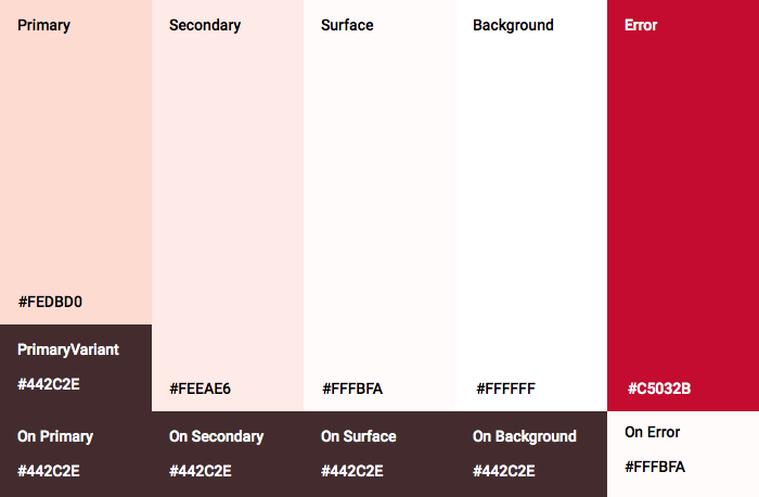
這個色彩主題是由設計師使用自訂顏色建立而成 (如下圖所示)。其中包含從 Shrine 品牌選取的顏色,並已套用至 Material Theme Editor,該編輯器已擴充這些顏色,建立更完整的調色盤。(這些顏色並非來自 2014 年的 Material 調色盤)。
Material Theme Editor 已將這些顏色整理成以數字標示的色調,包括每種顏色的 50、100、200 到 900 等標籤。Shrine 只會使用粉紅色色票的 50、100 和 300 色調,以及棕色色票的 900 色調。

現在來變更頂端應用程式列的顏色,以反映該色彩配置。
設定 colorPrimaryDark 和 colorAccent
在 colors.xml 中,修改下列行。colorAccent 屬性可控制頂端應用程式列的顏色等項目,colorPrimaryDark 屬性則可控制狀態列的顏色。
colors.xml
<color name="colorPrimaryDark">#FBB8AC</color>
<color name="colorAccent">#FEDBD0</color>
如要在狀態列中使用深色圖示,請在 Shrine 的應用程式主題中新增下列程式碼至 Theme.Shrine:
styles.xml
<item name="android:windowLightStatusBar" tools:targetApi="m">true</item>
您的 colors.xml 和 styles.xml 應如下所示:
colors.xml
<?xml version="1.0" encoding="utf-8"?>
<resources>
   <color name="colorPrimary">#E0E0E0</color>
   <color name="colorPrimaryDark">#FBB8AC</color>
   <color name="colorAccent">#FEDBD0</color>
   <color name="toolbarIconColor">#FFFFFF</color>
   <color name="loginPageBackgroundColor">#FFFFFF</color>
   <color name="productGridBackgroundColor">#FFFFFF</color>
</resources>
styles.xml
<resources xmlns:android="http://schemas.android.com/tools">

   <!-- Base application theme. -->
   <style name="Theme.Shrine" parent="Theme.MaterialComponents.Light.NoActionBar">
       <!-- Customize your theme here. -->
       <item name="colorPrimary">@color/colorPrimary</item>
       <item name="colorPrimaryDark">@color/colorPrimaryDark</item>
       <item name="colorAccent">@color/colorAccent</item>
       <item name="android:windowLightStatusBar" tools:targetApi="m">true</item>
   </style>

   <style name="Widget.Shrine.Toolbar" parent="Widget.AppCompat.Toolbar">
       <item name="android:background">?attr/colorAccent</item>
       <item name="android:theme">@style/ThemeOverlay.AppCompat.Dark.ActionBar</item>
       <item name="popupTheme">@style/ThemeOverlay.AppCompat.Light</item>
   </style>

</resources>
在 colors.xml 中,新增設為 #442C2E 的 textColorPrimary 顏色資源,並更新 toolbarIconColor 屬性以參照 textColorPrimary 顏色。
更新 styles.xml 檔案,將 android:textColorPrimary 屬性設為 textColorPrimary 顏色。
在 Theme.Shrine 中設定 android:textColorPrimary,即可為所有元素 (包括頂端應用程式列和頂端應用程式列中的圖示) 設定文字樣式。
最後,請將 Widget.Shrine.Toolbar 樣式中的 android:theme 屬性設為 Theme.Shrine。
您的 colors.xml 和 styles.xml 應如下所示:
colors.xml
<?xml version="1.0" encoding="utf-8"?>
<resources>
   <color name="colorPrimary">#E0E0E0</color>
   <color name="colorPrimaryDark">#FBB8AC</color>
   <color name="colorAccent">#FEDBD0</color>
   <color name="textColorPrimary">#442C2E</color>
   <color name="toolbarIconColor">@color/textColorPrimary</color>
   <color name="loginPageBackgroundColor">#FFFFFF</color>
   <color name="productGridBackgroundColor">#FFFFFF</color>
</resources>
styles.xml
<resources xmlns:android="http://schemas.android.com/tools">

   <!-- Base application theme. -->
   <style name="Theme.Shrine" parent="Theme.MaterialComponents.Light.NoActionBar">
       <!-- Customize your theme here. -->
       <item name="colorPrimary">@color/colorPrimary</item>
       <item name="colorPrimaryDark">@color/colorPrimaryDark</item>
       <item name="colorAccent">@color/colorAccent</item>
       <item name="android:windowLightStatusBar" tools:targetApi="m">true</item>
       <item name="android:textColorPrimary">@color/textColorPrimary</item>
   </style>

   <style name="Widget.Shrine.Toolbar" parent="Widget.AppCompat.Toolbar">
       <item name="android:background">?attr/colorAccent</item>
       <item name="android:theme">@style/Theme.Shrine</item>
       <item name="popupTheme">@style/ThemeOverlay.AppCompat.Light</item>
   </style>

</resources>
建構並執行。產品格線現在應如下所示:

讓我們變更登入畫面樣式,配合色彩配置。
設定文字欄位樣式
現在要將登入頁面的文字輸入內容改為外框樣式,並為版面配置使用更合適的顏色。
在 colors.xml 檔案中新增下列顏色資源:
colors.xml
<color name="textInputOutlineColor">#FBB8AC</color>
在 styles.xml 中新增兩種樣式:
styles.xml
<style name="Widget.Shrine.TextInputLayout" parent="Widget.MaterialComponents.TextInputLayout.OutlinedBox">
   <item name="hintTextAppearance">@style/TextAppearance.Shrine.TextInputLayout.HintText</item>
   <item name="hintTextColor">@color/textColorPrimary</item>
   <item name="android:paddingBottom">8dp</item>
   <item name="boxStrokeColor">@color/textInputOutlineColor</item>
</style>

<style name="TextAppearance.Shrine.TextInputLayout.HintText" parent="TextAppearance.MaterialComponents.Subtitle2">
   <item name="android:textColor">?android:attr/textColorPrimary</item>
</style>
最後,在 shr_login_fragment.xml 中,將兩個 TextInputLayout XML 元件的樣式屬性設為新樣式:
shr_login_fragment.xml
<com.google.android.material.textfield.TextInputLayout
   style="@style/Widget.Shrine.TextInputLayout"
   android:layout_width="match_parent"
   android:layout_height="wrap_content"
   android:hint="@string/shr_hint_username">

   <com.google.android.material.textfield.TextInputEditText
       android:layout_width="match_parent"
       android:layout_height="wrap_content"
       android:inputType="text"
       android:maxLines="1" />
</com.google.android.material.textfield.TextInputLayout>

<com.google.android.material.textfield.TextInputLayout
   android:id="@+id/password_text_input"
   style="@style/Widget.Shrine.TextInputLayout"
   android:layout_width="match_parent"
   android:layout_height="wrap_content"
   android:hint="@string/shr_hint_password"
   app:errorEnabled="true">

   <com.google.android.material.textfield.TextInputEditText
       android:id="@+id/password_edit_text"
       android:layout_width="match_parent"
       android:layout_height="wrap_content"
       android:inputType="textPassword" />
</com.google.android.material.textfield.TextInputLayout>
設定按鈕顏色樣式
最後,設定登入頁面上的按鈕顏色。在 styles.xml 中新增下列樣式:
styles.xml
<style name="Widget.Shrine.Button" parent="Widget.MaterialComponents.Button">
   <item name="android:textColor">?android:attr/textColorPrimary</item>
   <item name="backgroundTint">?attr/colorPrimaryDark</item>
</style>

<style name="Widget.Shrine.Button.TextButton" parent="Widget.MaterialComponents.Button.TextButton">
   <item name="android:textColor">?android:attr/textColorPrimary</item>
</style>
Widget.Shrine.Button 樣式會從預設的 MaterialButton 樣式擴充,並變更按鈕的文字顏色和背景色調。Widget.Shrine.Button.TextButton 會從預設的文字 MaterialButton樣式擴充,並只變更文字顏色。
在「Next」按鈕上設定 Widget.Shrine.Button 樣式,並在「Cancel」按鈕上設定 Widget.Shrine.Button.TextButton 樣式,如下所示:
shr_login_fragment.xml
<RelativeLayout
   android:layout_width="match_parent"
   android:layout_height="wrap_content">

   <com.google.android.material.button.MaterialButton
       android:id="@+id/next_button"
       style="@style/Widget.Shrine.Button"
       android:layout_width="wrap_content"
       android:layout_height="wrap_content"
       android:layout_alignParentEnd="true"
       android:layout_alignParentRight="true"
       android:text="@string/shr_button_next" />

   <com.google.android.material.button.MaterialButton
       android:id="@+id/cancel_button"
       style="@style/Widget.Shrine.Button.TextButton"
       android:layout_width="wrap_content"
       android:layout_height="wrap_content"
       android:layout_marginEnd="12dp"
       android:layout_marginRight="12dp"
       android:layout_toStartOf="@id/next_button"
       android:layout_toLeftOf="@id/next_button"
       android:text="@string/shr_button_cancel" />

</RelativeLayout>
更新登入頁面中 Shrine 標誌的顏色。這需要稍微變更向量可繪項目 shr_logo.xml。開啟可繪項目檔案,並將 android:fillAlpha 屬性變更為 1。可繪項目應如下所示:
shr_logo.xml
<vector xmlns:android="http://schemas.android.com/apk/res/android"
   android:width="149dp"
   android:height="152dp"
   android:tint="?attr/colorControlNormal"
   android:viewportWidth="149"
   android:viewportHeight="152">
   <path
       android:fillAlpha="1"
       android:fillColor="#DADCE0"
       android:fillType="evenOdd"
       android:pathData="M42.262,0L0,38.653L74.489,151.994L148.977,38.653L106.723,0M46.568,11.11L21.554,33.998L99.007,33.998L99.007,11.11L46.568,11.11ZM110.125,18.174L110.125,33.998L127.416,33.998L110.125,18.174ZM80.048,45.116L80.048,123.296L131.426,45.116L80.048,45.116ZM17.551,45.116L33.976,70.101L68.93,70.101L68.93,45.116L17.551,45.116ZM41.284,81.219L68.93,123.296L68.93,81.219L41.284,81.219Z"
       android:strokeWidth="1"
       android:strokeAlpha="0.4"
       android:strokeColor="#00000000" />
</vector>
將 shr_login_fragment.xml 中標誌 <ImageView> 的 android:tint 屬性設為 ?android:attr/textColorPrimary,如下所示:
shr_login_fragment.xml
<ImageView
   android:layout_width="64dp"
   android:layout_height="64dp"
   android:layout_gravity="center_horizontal"
   android:layout_marginTop="48dp"
   android:layout_marginBottom="16dp"
   android:tint="?android:attr/textColorPrimary"
   app:srcCompat="@drawable/shr_logo" />
建構並執行。登入畫面現在應如下所示:

4. 修改排版和標籤樣式
除了顏色變更外,設計人員也為您提供要在網站上使用的特定字體排版。我們也將其新增至頂端應用程式列。
設定頂端應用程式列的樣式
設定頂端應用程式列的文字外觀,使其符合設計師提供的規格。將下列文字外觀樣式新增至 styles.xml,並將 titleTextAppearance 屬性設為參照 Widget.Shrine.Toolbar 樣式中的這個樣式。
styles.xml
<style name="Widget.Shrine.Toolbar" parent="Widget.AppCompat.Toolbar">
   <item name="android:background">?attr/colorAccent</item>
   <item name="android:theme">@style/Theme.Shrine</item>
   <item name="popupTheme">@style/ThemeOverlay.AppCompat.Light</item>
   <item name="titleTextAppearance">@style/TextAppearance.Shrine.Toolbar</item>
</style>

<style name="TextAppearance.Shrine.Toolbar" parent="TextAppearance.MaterialComponents.Button">
   <item name="android:textSize">16sp</item>
</style>
您的 colors.xml 和 styles.xml 應如下所示:
colors.xml
<?xml version="1.0" encoding="utf-8"?>
<resources>
   <color name="colorPrimary">#E0E0E0</color>
   <color name="colorPrimaryDark">#FBB8AC</color>
   <color name="colorAccent">#FEDBD0</color>
   <color name="textColorPrimary">#442C2E</color>
   <color name="toolbarIconColor">@color/textColorPrimary</color>
   <color name="loginPageBackgroundColor">#FFFFFF</color>
   <color name="productGridBackgroundColor">#FFFFFF</color>
   <color name="textInputOutlineColor">#FBB8AC</color>
</resources>
styles.xml
<resources xmlns:android="http://schemas.android.com/tools">

   <!-- Base application theme. -->
   <style name="Theme.Shrine" parent="Theme.MaterialComponents.Light.NoActionBar">
       <!-- Customize your theme here. -->
       <item name="colorPrimary">@color/colorPrimary</item>
       <item name="colorPrimaryDark">@color/colorPrimaryDark</item>
       <item name="colorAccent">@color/colorAccent</item>
       <item name="android:windowLightStatusBar" tools:targetApi="m">true</item>
       <item name="android:textColorPrimary">@color/textColorPrimary</item>
   </style>

   <style name="Widget.Shrine.TextInputLayout" parent="Widget.MaterialComponents.TextInputLayout.OutlinedBox">
       <item name="hintTextAppearance">@style/TextAppearance.Shrine.TextInputLayout.HintText</item>
       <item name="hintTextColor">@color/textColorPrimary</item>
       <item name="android:paddingBottom">8dp</item>
       <item name="boxStrokeColor">@color/textInputOutlineColor</item>
   </style>

   <style name="TextAppearance.Shrine.TextInputLayout.HintText" parent="TextAppearance.MaterialComponents.Subtitle2">
       <item name="android:textColor">?android:attr/textColorPrimary</item>
   </style>


   <style name="Widget.Shrine.Button" parent="Widget.MaterialComponents.Button">
       <item name="android:textColor">?android:attr/textColorPrimary</item>
       <item name="backgroundTint">?attr/colorPrimaryDark</item>
   </style>

   <style name="Widget.Shrine.Button.TextButton" parent="Widget.MaterialComponents.Button.TextButton">
       <item name="android:textColor">?android:attr/textColorPrimary</item>
   </style>

   <style name="Widget.Shrine.Toolbar" parent="Widget.AppCompat.Toolbar">
       <item name="android:background">?attr/colorAccent</item>
       <item name="android:theme">@style/Theme.Shrine</item>
       <item name="popupTheme">@style/ThemeOverlay.AppCompat.Light</item>
       <item name="titleTextAppearance">@style/TextAppearance.Shrine.Toolbar</item>
   </style>

   <style name="TextAppearance.Shrine.Toolbar" parent="TextAppearance.MaterialComponents.Button">
       <item name="android:textSize">16sp</item>
   </style>

</resources>
設定標籤樣式
我們會設定產品資訊卡標籤的樣式,使用正確的文字外觀,並在資訊卡內水平置中。
將標題標籤的字型從 textAppearanceHeadline6 更新為 textAppearanceSubtitle2,如下所示:
shr_product_card.xml
<TextView
   android:id="@+id/product_title"
   android:layout_width="match_parent"
   android:layout_height="wrap_content"
   android:text="@string/shr_product_title"
   android:textAppearance="?attr/textAppearanceSubtitle2" />
如要將圖片標籤置中,請在 shr_product_card.xml 中修改標籤 <TextView>,設定 android:textAlignment="center" 屬性:
shr_product_card.xml
<LinearLayout
   android:layout_width="match_parent"
   android:layout_height="wrap_content"
   android:orientation="vertical"
   android:padding="16dp">

   <TextView
       android:id="@+id/product_title"
       android:layout_width="match_parent"
       android:layout_height="wrap_content"
       android:text="@string/shr_product_title"
       android:textAlignment="center"
       android:textAppearance="?attr/textAppearanceSubtitle2" />

   <TextView
       android:id="@+id/product_price"
       android:layout_width="match_parent"
       android:layout_height="wrap_content"
       android:text="@string/shr_product_description"
       android:textAlignment="center"
       android:textAppearance="?attr/textAppearanceBody2" />
</LinearLayout>
建構並執行。產品格線畫面現在應如下所示:

現在,請變更登入畫面的排版,使其與應用程式的排版一致。
變更登入畫面的字體
在 styles.xml 中新增下列樣式:
styles.xml
<style name="TextAppearance.Shrine.Title" parent="TextAppearance.MaterialComponents.Headline4">
   <item name="textAllCaps">true</item>
   <item name="android:textStyle">bold</item>
   <item name="android:textColor">?android:attr/textColorPrimary</item>
</style>
在 shr_login_fragment.xml 中,將新樣式設為「SHRINE」標題 <TextView> (並刪除其中的 textAllCaps 和 textSize 屬性):
shr_login_fragment.xml
<TextView
   android:layout_width="wrap_content"
   android:layout_height="wrap_content"
   android:layout_gravity="center_horizontal"
   android:layout_marginBottom="132dp"
   android:text="@string/shr_app_name"
   android:textAppearance="@style/TextAppearance.Shrine.Title" />
建構並執行。登入畫面現在應如下所示:

5. 調整高度
您已使用符合 Shrine 的特定顏色和字體排版設定頁面樣式,現在來看看顯示 Shrine 產品的資訊卡。目前會顯示在應用程式導覽列下方的白色介面上。讓我們更強調產品,吸引觀眾注意。
變更產品格線的立體感
讓我們變更頂端應用程式列和內容的高度,讓內容看起來像是在頂端應用程式列上方浮動的頁面。在 shr_product_grid_fragment.xml 中,將 app:elevation 屬性新增至 AppBarLayout,並將 android:elevation 屬性新增至 NestedScrollView XML 元件,如下所示:
shr_product_grid_fragment.xml
<com.google.android.material.appbar.AppBarLayout
   android:layout_width="match_parent"
   android:layout_height="wrap_content"
   app:elevation="0dp">

   <androidx.appcompat.widget.Toolbar
       android:id="@+id/app_bar"
       style="@style/Widget.Shrine.Toolbar"
       android:layout_width="match_parent"
       android:layout_height="?attr/actionBarSize"
       app:navigationIcon="@drawable/shr_menu"
       app:title="@string/shr_app_name" />
</com.google.android.material.appbar.AppBarLayout>

<androidx.core.widget.NestedScrollView
   android:layout_width="match_parent"
   android:layout_height="match_parent"
   android:layout_marginTop="56dp"
   android:background="@color/productGridBackgroundColor"
   android:elevation="8dp"
   android:paddingStart="@dimen/shr_product_grid_spacing"
   android:paddingEnd="@dimen/shr_product_grid_spacing"
   app:layout_behavior="@string/appbar_scrolling_view_behavior">

   <androidx.appcompat.app.AlertController.RecycleListView
       android:id="@+id/recycler_view"
       android:layout_width="match_parent"
       android:layout_height="match_parent" />

</androidx.core.widget.NestedScrollView>
變更資訊卡高度 (和顏色)
如要調整每張資訊卡的高度,請將 shr_product_card.xml 中的 2dp 從 2dp 變更為 0dp。app:cardElevation也請將 app:cardBackgroundColor 變更為 @android:color/transparent。
shr_product_card.xml
<com.google.material.card.MaterialCardView xmlns:android="http://schemas.android.com/apk/res/android"
   xmlns:app="http://schemas.android.com/apk/res-auto"
   android:layout_width="match_parent"
   android:layout_height="wrap_content"
   app:cardBackgroundColor="@android:color/transparent"
   app:cardElevation="0dp"
   app:cardPreventCornerOverlap="true">
快來看看!你已調整產品格狀頁面上每張資訊卡的高度。

變更「下一步」按鈕的高度
在 styles.xml 中,將下列屬性新增至 Widget.Shrine.Button 樣式:
styles.xml
<item name="android:stateListAnimator" tools:ignore="NewApi">
    @animator/shr_next_button_state_list_anim
</item>
在 Button 的樣式中設定 android:stateListAnimator,可讓「下一步」按鈕使用我們提供的動畫師。
建構並執行。登入畫面現在應如下所示:

6. 變更版面配置
變更版面配置,以不同顯示比例和大小顯示資訊卡,讓每張資訊卡看起來都與眾不同。
使用交錯 RecyclerView 轉換介面
我們在 staggeredgridlayout 套件中提供新的 RecyclerView 介面卡,可顯示非對稱交錯資訊卡版面配置,並以水平捲動方式呈現。您可以自行深入瞭解該程式碼,但我們不會在此說明實作方式。
如要使用這個新轉接程式,請修改 ProductGridFragment.java 中的 onCreateView() 方法。將「set up the RecyclerView」註解後的程式碼區塊替換為下列程式碼:
ProductGridFragment.java
// Set up the RecyclerView
RecyclerView recyclerView = view.findViewById(R.id.recycler_view);
recyclerView.setHasFixedSize(true);
GridLayoutManager gridLayoutManager = new GridLayoutManager(getContext(), 2, GridLayoutManager.HORIZONTAL, false);
gridLayoutManager.setSpanSizeLookup(new GridLayoutManager.SpanSizeLookup() {
   @Override
   public int getSpanSize(int position) {
       return position % 3 == 2 ? 2 : 1;
   }
});
recyclerView.setLayoutManager(gridLayoutManager);
StaggeredProductCardRecyclerViewAdapter adapter = new StaggeredProductCardRecyclerViewAdapter(
       ProductEntry.initProductEntryList(getResources()));
recyclerView.setAdapter(adapter);
int largePadding = getResources().getDimensionPixelSize(R.dimen.shr_staggered_product_grid_spacing_large);
int smallPadding = getResources().getDimensionPixelSize(R.dimen.shr_staggered_product_grid_spacing_small);
recyclerView.addItemDecoration(new ProductGridItemDecoration(largePadding, smallPadding));
我們也需要對 product_grid_fragment.xml 進行小幅變更,從 NestedScrollView 中移除邊框間距,如下所示:
shr_product_grid_fragment.xml
<androidx.core.widget.NestedScrollView
   android:layout_width="match_parent"
   android:layout_height="match_parent"
   android:layout_marginTop="56dp"
   android:background="@color/productGridBackgroundColor"
   app:layout_behavior="@string/appbar_scrolling_view_behavior"
   android:elevation="6dp">
最後,我們也會修改 ProductGridItemDecoration.java,調整 RecyclerView 內的卡片邊框間距。按照下列方式修改 ProductGridItemDecoration.java 的 getItemOffsets() 方法:
ProductGridItemDecoration.java
@Override
public void getItemOffsets(Rect outRect, View view,
                          RecyclerView parent, RecyclerView.State state) {
   outRect.left = smallPadding;
   outRect.right = largePadding;
}
建構並執行。產品格線項目現在應會交錯排列:

7. 試試其他主題
色彩是展現品牌形象的強大工具,只要稍微調整色彩,就能大幅提升使用者體驗。為了進行測試,我們來看看如果品牌色彩配置完全不同,Shrine 會是什麼樣子。
修改樣式和顏色
在 styles.xml 中新增下列主題:
styles.xml
<style name="Theme.Shrine.Autumn" parent="Theme.Shrine">
   <item name="colorPrimary">#FFCF44</item>
   <item name="colorPrimaryDark">#FD9725</item>
   <item name="colorAccent">#FD9725</item>
   <item name="colorOnPrimary">#FFFFFF</item>
   <item name="colorError">#FD9725</item>
</style>
在 AndroidManifest.xml 中,於應用程式中使用這個新主題:
AndroidManifest.xml
<application
   android:allowBackup="true"
   android:icon="@mipmap/ic_launcher"
   android:label="@string/shr_app_name"
   android:roundIcon="@mipmap/ic_launcher_round"
   android:supportsRtl="true"
   android:name="com.google.codelabs.mdc.java.shrine.application.ShrineApplication"
   android:theme="@style/Theme.Shrine.Autumn">
   <activity android:name=".MainActivity">
       <intent-filter>
           <action android:name="android.intent.action.MAIN" />

           <category android:name="android.intent.category.LAUNCHER" />
       </intent-filter>
   </activity>
</application>
在 colors.xml 中修改工具列圖示顏色,如下所示:
colors.xml
<color name="toolbarIconColor">#FFFFFF</color>
接著,將工具列樣式的 android:theme 屬性設為使用「?theme」屬性參照目前的主題,而非以硬式編碼方式指定:
styles.xml
<style name="Widget.Shrine.Toolbar" parent="Widget.AppCompat.Toolbar">
   <item name="android:background">?attr/colorAccent</item>
   <item name="android:theme">?theme</item>
   <item name="popupTheme">@style/ThemeOverlay.AppCompat.Light</item>
   <item name="titleTextAppearance">@style/TextAppearance.Shrine.Toolbar</item>
</style>
接著,調亮登入畫面文字欄位中的提示文字顏色。將 android:textColorHint 屬性新增至文字欄位的樣式:
styles.xml
<style name="Widget.Shrine.TextInputLayout" parent="Widget.MaterialComponents.TextInputLayout.OutlinedBox">
   <item name="hintTextAppearance">
@style/TextAppearance.Shrine.TextInputLayout.HintText
</item>
   <item name="android:paddingBottom">8dp</item>
   <item name="android:textColorHint">?attr/colorPrimaryDark</item>
</style>
建構並執行。現在應該會顯示新主題的預覽畫面。


在繼續進行 MDC-104 之前,請還原本節中變更的程式碼。
8. 重點回顧
到目前為止,您已建立的應用程式與設計師提供的設計規格相似。
後續步驟
您已使用這些 MDC 元件:主題、字體排版和高度。您可以在 MDC-Android 目錄中探索更多元件,請參閱「MDC Android 中的元件」。
如果預計的應用程式設計含有 MDC 程式庫中沒有的元素,該怎麼辦?在 MDC-104:Material Design 進階元件中,我們將說明如何使用 MDC 程式庫建立自訂元件,以達到特定外觀。