
1. مقدمه
Material Components (MDC) به توسعه دهندگان کمک می کند طراحی مواد را پیاده سازی کنند. MDC که توسط تیمی از مهندسان و طراحان UX در Google ایجاد شده است، دارای دهها مؤلفه رابط کاربری زیبا و کاربردی است و برای Android، iOS، وب و Flutter.material.io/develop در دسترس است. |
در Codelabs MDC-101 و MDC-102، از Material Components (MDC) برای ساختن اصول اولیه اپلیکیشنی به نام Shrine استفاده کردید، یک برنامه تجارت الکترونیک که لباس و کالاهای خانگی می فروشد. این برنامه شامل یک جریان کاربری است که با صفحه ورود شروع می شود و کاربر را به صفحه اصلی که محصولات را نمایش می دهد می برد.
گسترش اخیر متریال دیزاین به طراحان و توسعه دهندگان انعطاف بیشتری برای بیان برند محصول خود می دهد. اکنون می توانید از MDC برای سفارشی کردن Shrine و بازتاب سبک منحصر به فرد آن استفاده کنید.
چیزی که خواهی ساخت
در این کد لبه، شما Shrine را سفارشی میکنید تا برند آن را با استفاده از:
- رنگ
- تایپوگرافی
- ارتفاع
- طرح بندی
مولفه ها و زیرسیستم های اندروید MDC مورد استفاده در این کد لبه:
- تم ها
- تایپوگرافی
- ارتفاع
آنچه شما نیاز دارید
- دانش اولیه توسعه اندروید
- Android Studio (اگر قبلاً آن را ندارید آن را از اینجا دانلود کنید)
- شبیه ساز یا دستگاه اندروید (در دسترس از طریق Android Studio)
- کد نمونه (مرحله بعدی را ببینید)
سطح تجربه خود را در ساخت برنامه های اندروید چگونه ارزیابی می کنید؟
2. محیط توسعه خود را تنظیم کنید
از MDC-102 ادامه می دهید؟
اگر MDC-102 را تکمیل کرده اید، کد شما باید برای این کد لبه آماده باشد. به مرحله 3 بروید: رنگ را تغییر دهید .
برنامه codelab starter را دانلود کنید
برنامه شروع در فهرست راهنمای material-components-android-codelabs-103-starter/kotlin قرار دارد. حتما قبل از شروع به آن دایرکتوری cd بزنید.
... یا آن را از GitHub شبیه سازی کنید
برای شبیه سازی این کد لبه از GitHub، دستورات زیر را اجرا کنید:
git clone https://github.com/material-components/material-components-android-codelabs
cd material-components-android-codelabs/
git checkout 103-starter
کد شروع را در Android Studio بارگیری کنید
- هنگامی که جادوگر راه اندازی به پایان رسید و پنجره خوش آمدید به Android Studio نشان داده شد، روی باز کردن پروژه موجود Android Studio کلیک کنید. به فهرستی که کد نمونه را در آن نصب کرده بودید بروید و kotlin -> shrine را انتخاب کنید (یا در رایانه خود برای shrine جستجو کنید) تا پروژه حمل و نقل باز شود.
- همانطور که توسط نشانگرهای فعالیت در پایین پنجره Android Studio نشان داده شده است، کمی صبر کنید تا Android Studio پروژه را بسازد و همگام کند.
- در این مرحله، Android Studio ممکن است برخی از خطاهای ساخت را ایجاد کند زیرا شما Android SDK یا ابزارهای ساخت را از دست داده اید، مانند آنچه در زیر نشان داده شده است. دستورالعملهای موجود در Android Studio را برای نصب/بهروزرسانی و همگامسازی پروژه خود دنبال کنید.

وابستگی های پروژه را اضافه کنید
این پروژه به کتابخانه پشتیبانی MDC Android نیاز دارد. کد نمونه ای که دانلود کرده اید باید قبلاً این وابستگی را در لیست داشته باشد، اما برای اطمینان از انجام مراحل زیر تمرین خوبی است.
- به فایل
build.gradleماژولappبروید و مطمئن شوید که بلوکdependenciesدارای وابستگی به MDC Android است:
api 'com.google.android.material:material:1.1.0-alpha06'
- (اختیاری) در صورت لزوم، فایل
build.gradleرا ویرایش کنید تا وابستگی های زیر را اضافه کنید و پروژه را همگام سازی کنید.
dependencies {
    api 'com.google.android.material:material:1.1.0-alpha06'
    implementation 'androidx.legacy:legacy-support-v4:1.0.0'
    implementation 'com.android.volley:volley:1.1.1'
    implementation 'com.google.code.gson:gson:2.8.5'
    implementation "org.jetbrains.kotlin:kotlin-stdlib-jdk7:1.3.21"
    testImplementation 'junit:junit:4.12'
    androidTestImplementation 'androidx.test:core:1.1.0'
    androidTestImplementation 'androidx.test.ext:junit:1.1.0'
    androidTestImplementation 'androidx.test:runner:1.2.0-alpha05'
    androidTestImplementation 'androidx.test.espresso:espresso-core:3.2.0-alpha05'
}
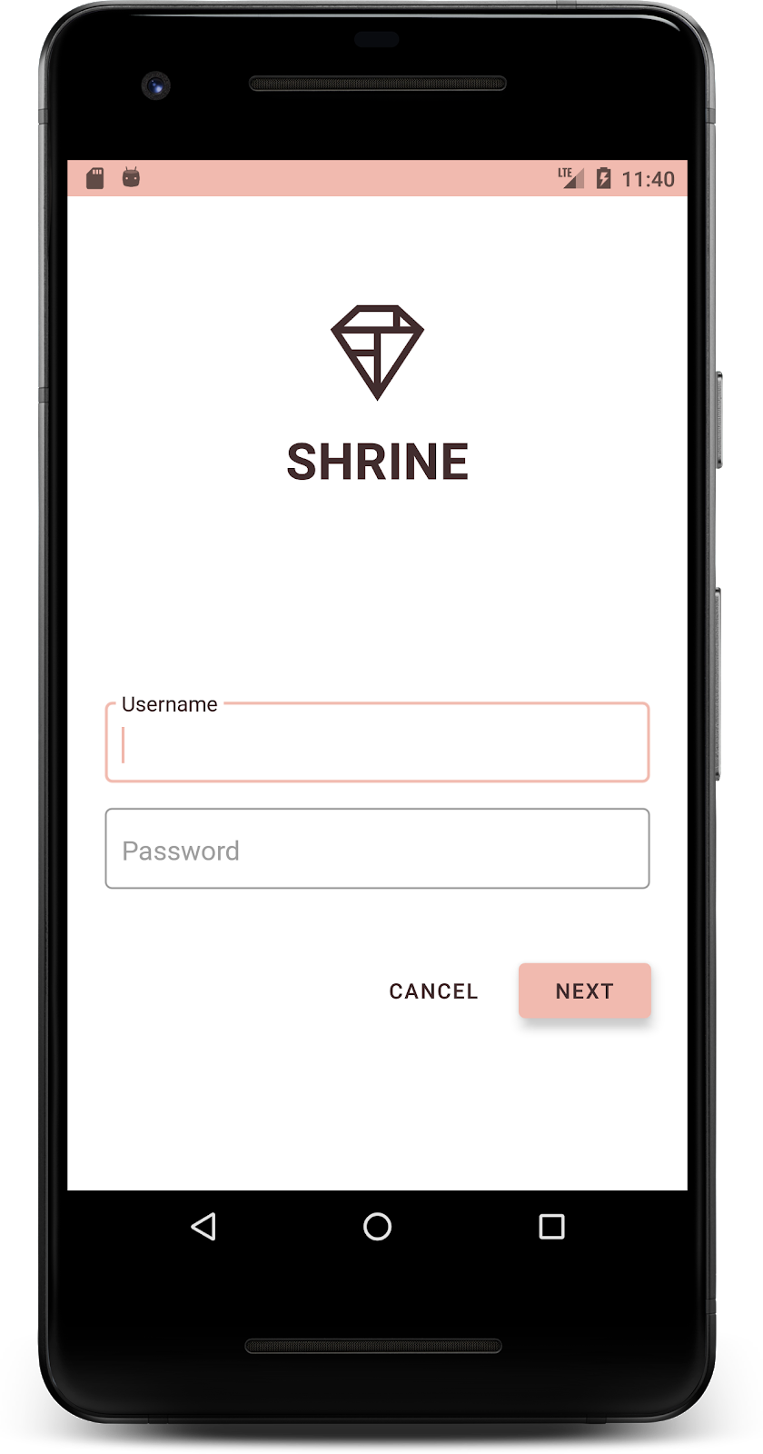
برنامه استارتر را اجرا کنید
|

موفقیت! باید صفحه ورود به سیستم Shrine را در دستگاه یا شبیه ساز خود مشاهده کنید. وقتی Next را فشار دهید، صفحه اصلی Shrine با نوار برنامه در بالا و شبکهای از تصاویر محصول در زیر ظاهر میشود.
بیایید با تغییر رنگ، ارتفاع و تایپوگرافی، نوار بالای برنامه را با برند Shrine مطابقت دهیم.
3. رنگ را تغییر دهید
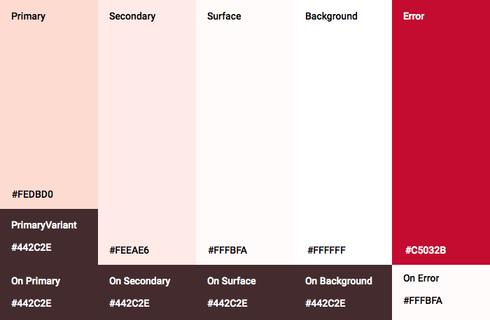
این تم رنگی توسط یک طراح با رنگ های دلخواه (در تصویر زیر) ایجاد شده است. این شامل رنگهایی است که از برند Shrine انتخاب شده و در ویرایشگر تم مواد اعمال شدهاند، که آنها را برای ایجاد یک پالت کاملتر گسترش داده است. (این رنگ ها از پالت های رنگ مواد 2014 نیستند.)
ویرایشگر تم مواد آنها را در سایه هایی با برچسب عددی، از جمله برچسب های 50، 100، 200، .... تا 900 از هر رنگ، سازماندهی کرده است. حرم فقط از سایه های 50، 100 و 300 از نمونه صورتی و 900 از نمونه قهوه ای استفاده می کند.

بیایید رنگ نوار بالای برنامه را تغییر دهیم تا آن طرح رنگی را منعکس کند.
colorPrimaryDark و colorAccent را تنظیم کنید
در colors.xml ، خطوط زیر را تغییر دهید. ویژگی colorAccent رنگ نوار بالای برنامه را از جمله موارد دیگر کنترل می کند و ویژگی colorPrimaryDark رنگ نوار وضعیت را کنترل می کند.
Colors.xml
<color name="colorPrimaryDark">#FBB8AC</color>
<color name="colorAccent">#FEDBD0</color>
برای استفاده از نمادهای تیره در نوار وضعیت، موارد زیر را به Theme.Shrine ، موضوع برنامه Shrine اضافه کنید:
styles.xml
<item name="android:windowLightStatusBar" tools:targetApi="m">true</item>
<resources xmlns:tools="http://schemas.android.com/tools">
colors.xml و styles.xml شما باید به شکل زیر باشد:
Colors.xml
<?xml version="1.0" encoding="utf-8"?>
<resources>
   <color name="colorPrimary">#E0E0E0</color>
   <color name="colorPrimaryDark">#FBB8AC</color>
   <color name="colorAccent">#FEDBD0</color>
   <color name="toolbarIconColor">#FFFFFF</color>
   <color name="loginPageBackgroundColor">#FFFFFF</color>
   <color name="productGridBackgroundColor">#FFFFFF</color>
</resources>
styles.xml
<resources xmlns:android="http://schemas.android.com/tools">

   <!-- Base application theme. -->
   <style name="Theme.Shrine" parent="Theme.MaterialComponents.Light.NoActionBar">
       <!-- Customize your theme here. -->
       <item name="colorPrimary">@color/colorPrimary</item>
       <item name="colorPrimaryDark">@color/colorPrimaryDark</item>
       <item name="colorAccent">@color/colorAccent</item>
       <item name="android:windowLightStatusBar" tools:targetApi="m">true</item>
   </style>

   <style name="Widget.Shrine.Toolbar" parent="Widget.AppCompat.Toolbar">
       <item name="android:background">?attr/colorAccent</item>
       <item name="android:theme">@style/ThemeOverlay.AppCompat.Dark.ActionBar</item>
       <item name="popupTheme">@style/ThemeOverlay.AppCompat.Light</item>
   </style>

</resources>
در colors.xml ، یک منبع رنگی جدید textColorPrimary را با تنظیم #442C2E اضافه کنید، و صفت toolbarIconColor را برای ارجاع به رنگ textColorPrimary به روز کنید.
برای تنظیم فایل styles.xml خود را به روز کنید
به رنگ textColorPrimary که به تازگی تعریف کردیم نسبت داده شود.
یک چیز دیگر: ویژگی android:theme در سبک Widget.Shrine.Toolbar روی Theme.Shrine قرار دهید.
colors.xml و styles.xml شما باید به شکل زیر باشد:
Colors.xml
<?xml version="1.0" encoding="utf-8"?>
<resources>
   <color name="colorPrimary">#E0E0E0</color>
   <color name="colorPrimaryDark">#FBB8AC</color>
   <color name="colorAccent">#FEDBD0</color>
   <color name="textColorPrimary">#442C2E</color>
   <color name="toolbarIconColor">@color/textColorPrimary</color>
   <color name="loginPageBackgroundColor">#FFFFFF</color>
   <color name="productGridBackgroundColor">#FFFFFF</color>
</resources>
styles.xml
<resources xmlns:android="http://schemas.android.com/tools">

   <!-- Base application theme. -->
   <style name="Theme.Shrine" parent="Theme.MaterialComponents.Light.NoActionBar">
       <!-- Customize your theme here. -->
       <item name="colorPrimary">@color/colorPrimary</item>
       <item name="colorPrimaryDark">@color/colorPrimaryDark</item>
       <item name="colorAccent">@color/colorAccent</item>
       <item name="android:windowLightStatusBar" tools:targetApi="m">true</item>
       <item name="android:textColorPrimary">@color/textColorPrimary</item>
   </style>

   <style name="Widget.Shrine.Toolbar" parent="Widget.AppCompat.Toolbar">
       <item name="android:background">?attr/colorAccent</item>
       <item name="android:theme">@style/Theme.Shrine</item>
       <item name="popupTheme">@style/ThemeOverlay.AppCompat.Light</item>
   </style>

</resources>
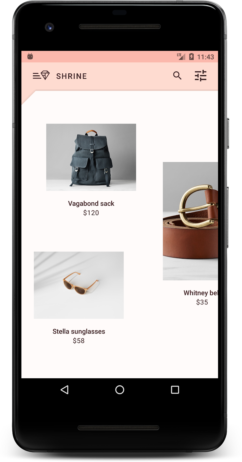
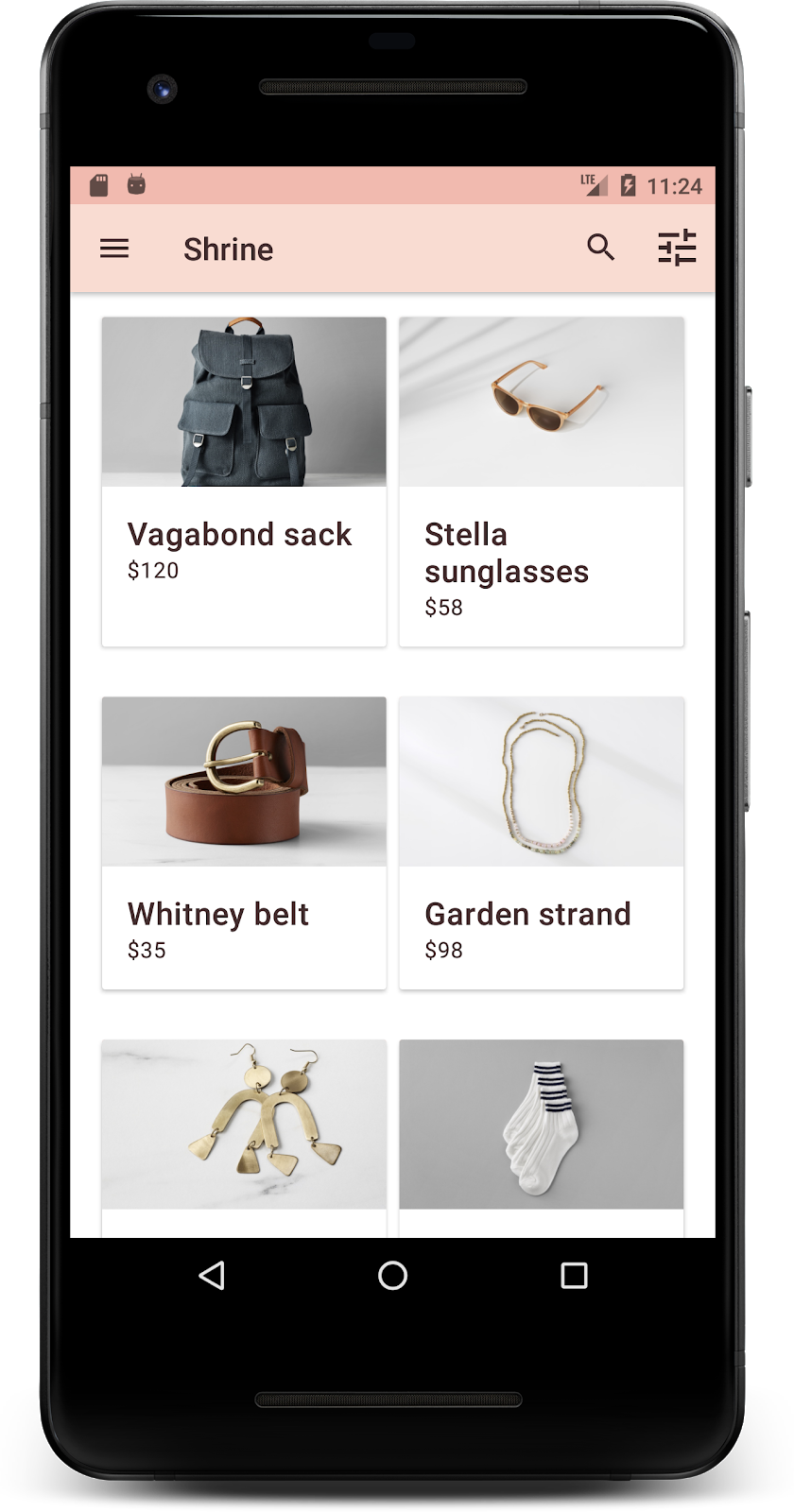
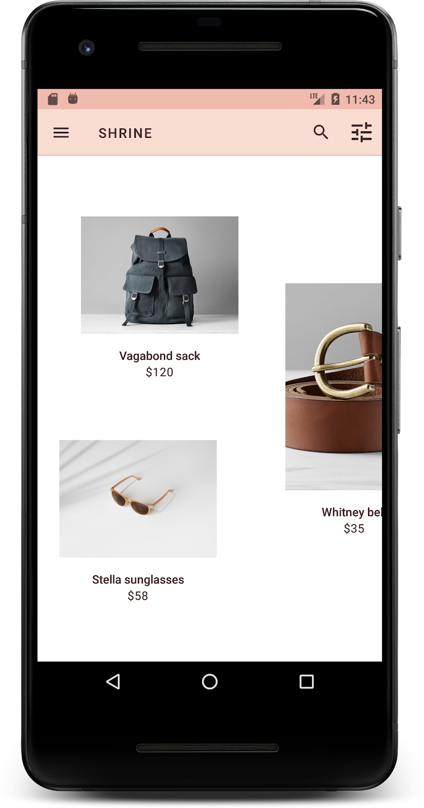
بسازید و اجرا کنید. شبکه محصول شما اکنون باید به شکل زیر باشد:
بیایید سبک صفحه ورود به سیستم را تغییر دهیم تا با طرح رنگ ما مطابقت داشته باشد.
به فیلدهای متنی استایل دهید
بیایید ورودی های متن در صفحه ورود را تغییر دهیم تا مشخص شود و از رنگ های بهتر برای طرح بندی خود استفاده کنیم.
منبع رنگ زیر را به فایل colors.xml خود اضافه کنید:
Colors.xml
<color name="textInputOutlineColor">#FBB8AC</color>
دو سبک جدید به styles.xml خود اضافه کنید:
styles.xml
<style name="Widget.Shrine.TextInputLayout" parent="Widget.MaterialComponents.TextInputLayout.OutlinedBox">
   <item name="hintTextAppearance">@style/TextAppearance.Shrine.TextInputLayout.HintText</item>
   <item name="hintTextColor">@color/textColorPrimary</item>
   <item name="android:paddingBottom">8dp</item>
   <item name="boxStrokeColor">@color/textInputOutlineColor</item>
</style>

<style name="TextAppearance.Shrine.TextInputLayout.HintText" parent="TextAppearance.MaterialComponents.Subtitle2">
   <item name="android:textColor">?android:attr/textColorPrimary</item>
</style>
در نهایت، ویژگی style را در هر دو مؤلفه XML TextInputLayout در shr_login_fragment.xml به سبک جدید خود تنظیم کنید:
shr_login_fragment.xml
<com.google.android.material.textfield.TextInputLayout
   style="@style/Widget.Shrine.TextInputLayout"
   android:layout_width="match_parent"
   android:layout_height="wrap_content"
   android:hint="@string/shr_hint_username">

   <com.google.android.material.textfield.TextInputEditText
       android:layout_width="match_parent"
       android:layout_height="wrap_content"
       android:inputType="text"
       android:maxLines="1" />
</com.google.android.material.textfield.TextInputLayout>

<com.google.android.material.textfield.TextInputLayout
   android:id="@+id/password_text_input"
   style="@style/Widget.Shrine.TextInputLayout"
   android:layout_width="match_parent"
   android:layout_height="wrap_content"
   android:hint="@string/shr_hint_password"
   app:errorEnabled="true">

   <com.google.android.material.textfield.TextInputEditText
       android:id="@+id/password_edit_text"
       android:layout_width="match_parent"
       android:layout_height="wrap_content"
       android:inputType="textPassword" />
</com.google.android.material.textfield.TextInputLayout>
رنگ های دکمه را سبک کنید
در نهایت رنگ دکمه های صفحه ورود را استایل دهید. استایل های زیر را به styles.xml خود اضافه کنید:
styles.xml
<style name="Widget.Shrine.Button" parent="Widget.MaterialComponents.Button">
   <item name="android:textColor">?android:attr/textColorPrimary</item>
   <item name="backgroundTint">?attr/colorPrimaryDark</item>
</style>

<style name="Widget.Shrine.Button.TextButton" parent="Widget.MaterialComponents.Button.TextButton">
   <item name="android:textColor">?android:attr/textColorPrimary</item>
</style>
سبک Widget.Shrine.Button از سبک MaterialButton پیشفرض گسترش مییابد و رنگ متن و رنگ پسزمینه دکمه را تغییر میدهد. Widget.Shrine.Button.TextButton از سبک متن پیش فرض MaterialButton گسترش می یابد و فقط رنگ متن را تغییر می دهد.
استایل Widget.Shrine.Button را روی دکمه Next و سبک Widget.Shrine.Button.TextButton را روی دکمه Cancel به صورت زیر تنظیم کنید:
shr_login_fragment.xml
<RelativeLayout
   android:layout_width="match_parent"
   android:layout_height="wrap_content">

   <com.google.android.material.button.MaterialButton
       android:id="@+id/next_button"
       style="@style/Widget.Shrine.Button"
       android:layout_width="wrap_content"
       android:layout_height="wrap_content"
       android:layout_alignParentEnd="true"
       android:layout_alignParentRight="true"
       android:text="@string/shr_button_next" />

   <com.google.android.material.button.MaterialButton
       android:id="@+id/cancel_button"
       style="@style/Widget.Shrine.Button.TextButton"
       android:layout_width="wrap_content"
       android:layout_height="wrap_content"
       android:layout_marginEnd="12dp"
       android:layout_marginRight="12dp"
       android:layout_toStartOf="@id/next_button"
       android:layout_toLeftOf="@id/next_button"
       android:text="@string/shr_button_cancel" />

</RelativeLayout>
رنگ آرم حرم را در صفحه ورود به روز کنید. این به یک تغییر کوچک در وکتور قابل ترسیم، shr_logo.xml نیاز دارد. فایل drawable را باز کنید و ویژگی android:fillAlpha به 1 تغییر دهید. drawable باید به شکل زیر باشد:
shr_logo.xml
<vector xmlns:android="http://schemas.android.com/apk/res/android"
   android:width="149dp"
   android:height="152dp"
   android:tint="?attr/colorControlNormal"
   android:viewportWidth="149"
   android:viewportHeight="152">
   <path
       android:fillAlpha="1"
       android:fillColor="#DADCE0"
       android:fillType="evenOdd"
       android:pathData="M42.262,0L0,38.653L74.489,151.994L148.977,38.653L106.723,0M46.568,11.11L21.554,33.998L99.007,33.998L99.007,11.11L46.568,11.11ZM110.125,18.174L110.125,33.998L127.416,33.998L110.125,18.174ZM80.048,45.116L80.048,123.296L131.426,45.116L80.048,45.116ZM17.551,45.116L33.976,70.101L68.93,70.101L68.93,45.116L17.551,45.116ZM41.284,81.219L68.93,123.296L68.93,81.219L41.284,81.219Z"
       android:strokeWidth="1"
       android:strokeAlpha="0.4"
       android:strokeColor="#00000000" />
</vector>
سپس، ویژگی android:tint روی لوگوی <ImageView> در shr_login_fragment.xml روی ?android:attr/textColorPrimary به صورت زیر تنظیم کنید:
shr_login_fragment.xml
<ImageView
   android:layout_width="64dp"
   android:layout_height="64dp"
   android:layout_gravity="center_horizontal"
   android:layout_marginTop="48dp"
   android:layout_marginBottom="16dp"
   android:tint="?android:attr/textColorPrimary"
   app:srcCompat="@drawable/shr_logo" />
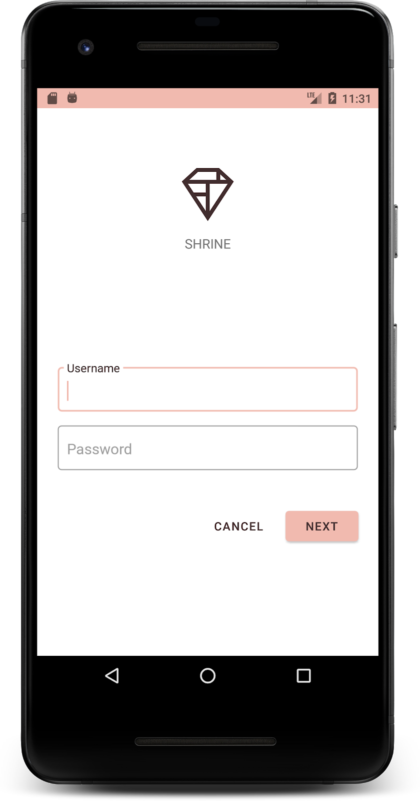
بسازید و اجرا کنید. اکنون صفحه ورود شما باید به شکل زیر باشد:
4. تایپوگرافی و سبک های برچسب را تغییر دهید
علاوه بر تغییر رنگ، طراح شما تایپوگرافی خاصی را نیز برای استفاده در سایت به شما داده است. بیایید آن را به نوار بالای برنامه نیز اضافه کنیم.
نوار برنامه بالا را استایل کنید
ظاهر متن نوار بالای برنامه خود را طوری طراحی کنید که با مشخصات ارائه شده توسط طراح شما مطابقت داشته باشد. سبک ظاهر متن زیر را به styles.xml اضافه کنید و ویژگی titleTextAppearance را برای ارجاع به این سبک در سبک Widget.Shrine.Toolbar خود تنظیم کنید.
styles.xml
<style name="Widget.Shrine.Toolbar" parent="Widget.AppCompat.Toolbar">
   <item name="android:background">?attr/colorAccent</item>
   <item name="android:theme">@style/Theme.Shrine</item>
   <item name="popupTheme">@style/ThemeOverlay.AppCompat.Light</item>
   <item name="titleTextAppearance">@style/TextAppearance.Shrine.Toolbar</item>
</style>

<style name="TextAppearance.Shrine.Toolbar" parent="TextAppearance.MaterialComponents.Button">
   <item name="android:textSize">16sp</item>
</style>
colors.xml و styles.xml شما باید به شکل زیر باشد:
Colors.xml
<?xml version="1.0" encoding="utf-8"?>
<resources>
   <color name="colorPrimary">#E0E0E0</color>
   <color name="colorPrimaryDark">#FBB8AC</color>
   <color name="colorAccent">#FEDBD0</color>
   <color name="textColorPrimary">#442C2E</color>
   <color name="toolbarIconColor">@color/textColorPrimary</color>
   <color name="loginPageBackgroundColor">#FFFFFF</color>
   <color name="productGridBackgroundColor">#FFFFFF</color>
   <color name="textInputOutlineColor">#FBB8AC</color>
</resources>
styles.xml
<resources xmlns:android="http://schemas.android.com/tools">

   <!-- Base application theme. -->
   <style name="Theme.Shrine" parent="Theme.MaterialComponents.Light.NoActionBar">
       <!-- Customize your theme here. -->
       <item name="colorPrimary">@color/colorPrimary</item>
       <item name="colorPrimaryDark">@color/colorPrimaryDark</item>
       <item name="colorAccent">@color/colorAccent</item>
       <item name="android:windowLightStatusBar" tools:targetApi="m">true</item>
       <item name="android:textColorPrimary">@color/textColorPrimary</item>
   </style>

   <style name="Widget.Shrine.TextInputLayout" parent="Widget.MaterialComponents.TextInputLayout.OutlinedBox">
       <item name="hintTextAppearance">@style/TextAppearance.Shrine.TextInputLayout.HintText</item>
       <item name="hintTextColor">@color/textColorPrimary</item>
       <item name="android:paddingBottom">8dp</item>
       <item name="boxStrokeColor">@color/textInputOutlineColor</item>
   </style>

   <style name="TextAppearance.Shrine.TextInputLayout.HintText" parent="TextAppearance.MaterialComponents.Subtitle2">
       <item name="android:textColor">?android:attr/textColorPrimary</item>
   </style>

   <style name="Widget.Shrine.Button" parent="Widget.MaterialComponents.Button">
       <item name="android:textColor">?android:attr/textColorPrimary</item>
       <item name="backgroundTint">?attr/colorPrimaryDark</item>
   </style>

   <style name="Widget.Shrine.Button.TextButton" parent="Widget.MaterialComponents.Button.TextButton">
       <item name="android:textColor">?android:attr/textColorPrimary</item>
   </style>

   <style name="Widget.Shrine.Toolbar" parent="Widget.AppCompat.Toolbar">
       <item name="android:background">?attr/colorAccent</item>
       <item name="android:theme">@style/Theme.Shrine</item>
       <item name="popupTheme">@style/ThemeOverlay.AppCompat.Light</item>
       <item name="titleTextAppearance">@style/TextAppearance.Shrine.Toolbar</item>
   </style>

   <style name="TextAppearance.Shrine.Toolbar" parent="TextAppearance.MaterialComponents.Button">
       <item name="android:textSize">16sp</item>
   </style>

</resources>
به برچسب ها سبک دهید
ما به برچسبهای کارت محصول استایل میدهیم تا از ظاهر متن صحیح استفاده کنند و به صورت افقی در کارت قرار بگیرند.
تایپوگرافی برچسب عنوان خود را از textAppearanceHeadline6 به textAppearanceSubtitle2 به صورت زیر به روز کنید:
shr_product_card.xml
<TextView
   android:id="@+id/product_title"
   android:layout_width="match_parent"
   android:layout_height="wrap_content"
   android:text="@string/shr_product_title"
   android:textAppearance="?attr/textAppearanceSubtitle2" />
برای وسط برچسبهای تصویر، برچسب <TextView> s را در shr_product_card.xml تغییر دهید تا ویژگی android:textAlignment="center" را تنظیم کنید:
shr_product_card.xml
<LinearLayout
   android:layout_width="match_parent"
   android:layout_height="wrap_content"
   android:orientation="vertical"
   android:padding="16dp">

   <TextView
       android:id="@+id/product_title"
       android:layout_width="match_parent"
       android:layout_height="wrap_content"
       android:text="@string/shr_product_title"
       android:textAlignment="center"
       android:textAppearance="?attr/textAppearanceSubtitle2" />

   <TextView
       android:id="@+id/product_price"
       android:layout_width="match_parent"
       android:layout_height="wrap_content"
       android:text="@string/shr_product_description"
       android:textAlignment="center"
       android:textAppearance="?attr/textAppearanceBody2" />
</LinearLayout>
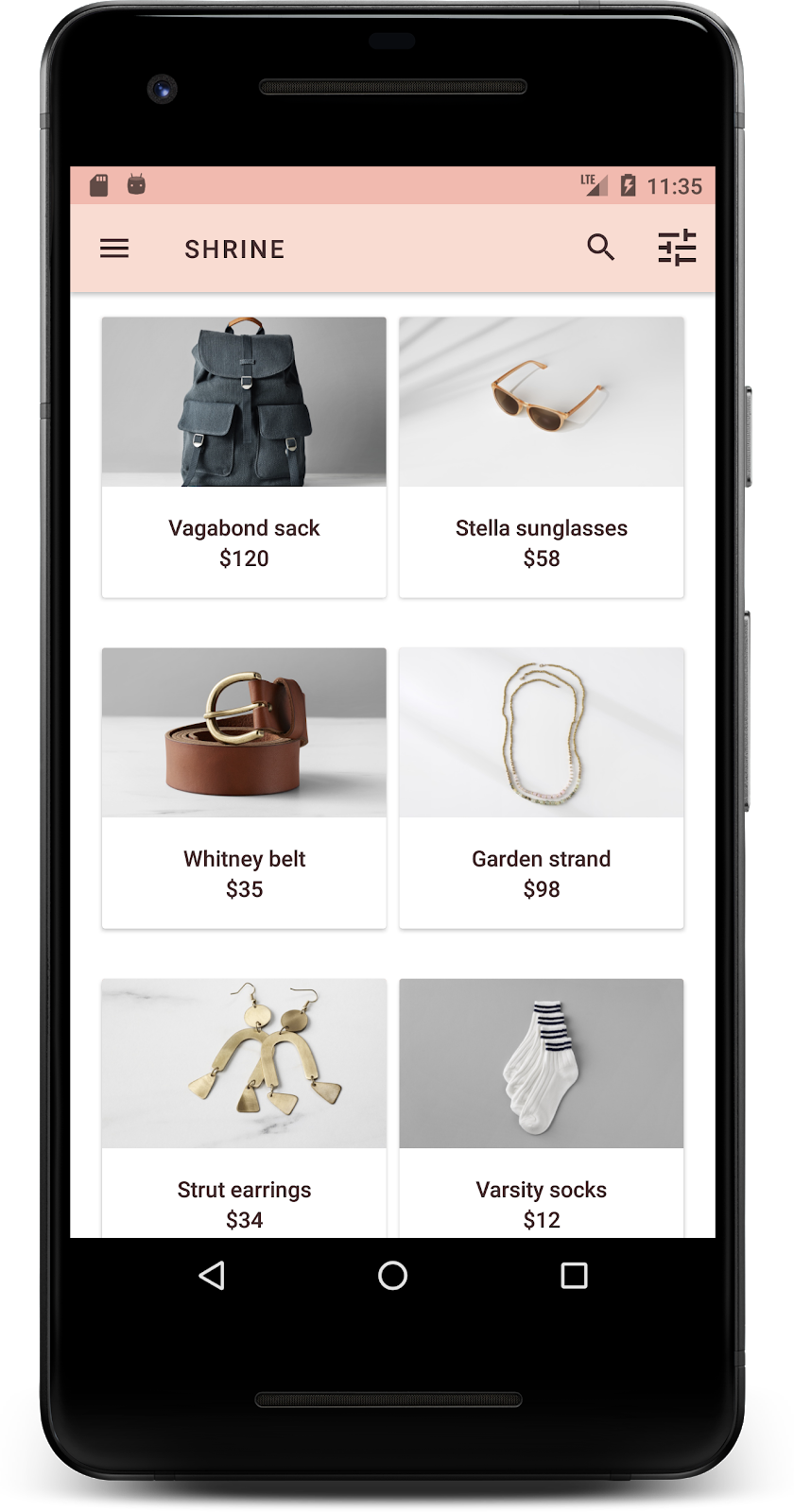
بسازید و اجرا کنید. صفحه شبکه محصول شما اکنون باید به شکل زیر باشد:
بیایید تایپوگرافی صفحه ورود به سیستم را برای مطابقت تغییر دهیم.
نوع صفحه ورود به سیستم را تغییر دهید
در styles.xml ، استایل زیر را اضافه کنید:
styles.xml
<style name="TextAppearance.Shrine.Title" parent="TextAppearance.MaterialComponents.Headline4">
   <item name="textAllCaps">true</item>
   <item name="android:textStyle">bold</item>
   <item name="android:textColor">?android:attr/textColorPrimary</item>
</style>
در shr_login_fragment.xml ، استایل جدید را روی عنوان «SHRINE» خود <TextView> تنظیم کنید (و صفات textAllCaps و textSize را که در آنجا هستند حذف کنید):
shr_login_fragment.xml
<TextView
   android:layout_width="wrap_content"
   android:layout_height="wrap_content"
   android:layout_gravity="center_horizontal"
   android:layout_marginBottom="132dp"
   android:text="@string/shr_app_name"
   android:textAppearance="@style/TextAppearance.Shrine.Title" />
بسازید و اجرا کنید. اکنون صفحه ورود شما باید به شکل زیر باشد:

5. ارتفاع را تنظیم کنید
اکنون که صفحه را با رنگ و تایپوگرافی خاص مطابق با Shrine استایل دادهاید، بیایید نگاهی به کارتهایی بیندازیم که محصولات Shrine را نشان میدهند. در حال حاضر، آنها بر روی یک سطح سفید در زیر ناوبری برنامه قرار می گیرند. برای جلب توجه به محصولات، بیایید به آنها تأکید بیشتری کنیم.
تغییر ارتفاع شبکه محصول
برای اینکه به نظر برسد محتوا روی صفحهای شناور در بالای نوار برنامه بالا قرار دارد، ارتفاعات نوار برنامه بالایی را تغییر دهید. ویژگی app:elevation به AppBarLayout خود و android:elevation به اجزای NestedScrollView XML خود در shr_product_grid_fragment.xml به صورت زیر اضافه کنید:
shr_product_grid_fragment.xml
<com.google.android.material.appbar.AppBarLayout
   android:layout_width="match_parent"
   android:layout_height="wrap_content"
   app:elevation="0dp">

   <androidx.appcompat.widget.Toolbar
       android:id="@+id/app_bar"
       style="@style/Widget.Shrine.Toolbar"
       android:layout_width="match_parent"
       android:layout_height="?attr/actionBarSize"
       app:navigationIcon="@drawable/shr_menu"
       app:title="@string/shr_app_name" />
</com.google.android.material.appbar.AppBarLayout>

<androidx.core.widget.NestedScrollView
   android:layout_width="match_parent"
   android:layout_height="match_parent"
   android:layout_marginTop="56dp"
   android:background="@color/productGridBackgroundColor"
   android:elevation="8dp"
   android:paddingStart="@dimen/shr_product_grid_spacing"
   android:paddingEnd="@dimen/shr_product_grid_spacing"
   app:layout_behavior="@string/appbar_scrolling_view_behavior">

   <androidx.recyclerview.widget.RecyclerView
       android:id="@+id/recycler_view"
       android:layout_width="match_parent"
       android:layout_height="match_parent" />

</androidx.core.widget.NestedScrollView>
تغییر ارتفاع کارت (و رنگ)
ارتفاع هر کارت را با تغییر app:cardElevation در shr_product_card.xml از 2dp به 0dp تنظیم کنید. app:cardBackgroundColor نیز به @android:color/transparent تغییر دهید.
shr_product_card.xml
<com.google.android.material.card.MaterialCardView xmlns:android="http://schemas.android.com/apk/res/android"
   xmlns:app="http://schemas.android.com/apk/res-auto"
   android:layout_width="match_parent"
   android:layout_height="wrap_content"
   app:cardBackgroundColor="@android:color/transparent"
   app:cardElevation="0dp"
   app:cardPreventCornerOverlap="true">
نگاهی بینداز! شما ارتفاع هر کارت را در صفحه شبکه محصول تنظیم کرده اید.

ارتفاع دکمه Next را تغییر دهید
در styles.xml ، ویژگی زیر را به استایل Widget.Shrine.Button خود اضافه کنید:
styles.xml
<item name="android:stateListAnimator" tools:ignore="NewApi">
    @animator/shr_next_button_state_list_anim
</item>
تنظیم android:stateListAnimator به سبک Button ، دکمه Next را برای استفاده از انیماتوری که ما ارائه کردهایم تنظیم میکند.
بسازید و اجرا کنید. اکنون صفحه ورود شما باید به شکل زیر باشد:
6. چیدمان را تغییر دهید
بیایید طرحبندی را تغییر دهیم تا کارتها را با نسبتها و اندازههای مختلف نشان دهیم، به طوری که هر کارت از کارتهای دیگر منحصربهفرد به نظر برسد.
از یک آداپتور RecyclerView staggered استفاده کنید
ما یک آداپتور RecyclerView جدید برای شما در بسته staggeredgridlayout ارائه کردهایم که طرحبندی کارت پلکانی نامتقارن را نشان میدهد که به معنای اسکرول افقی است. به راحتی می توانید آن کد را به تنهایی بررسی کنید، اما ما در اینجا به نحوه پیاده سازی آن نمی پردازیم.
برای استفاده از این آداپتور جدید، روش onCreateView() خود را در ProductGridFragment.kt تغییر دهید. بلوک کد را بعد از کامنت "setup the RecyclerView " با موارد زیر جایگزین کنید:
ProductGridFragment.kt
// Set up the RecyclerView
view.recycler_view.setHasFixedSize(true)
val gridLayoutManager = GridLayoutManager(context, 2, RecyclerView.HORIZONTAL, false)
gridLayoutManager.spanSizeLookup = object : GridLayoutManager.SpanSizeLookup() {
   override fun getSpanSize(position: Int): Int {
       return if (position % 3 == 2) 2 else 1
   }
}
view.recycler_view.layoutManager = gridLayoutManager
val adapter = StaggeredProductCardRecyclerViewAdapter(
       ProductEntry.initProductEntryList(resources))
view.recycler_view.adapter = adapter
val largePadding = resources.getDimensionPixelSize(R.dimen.shr_staggered_product_grid_spacing_large)
val smallPadding = resources.getDimensionPixelSize(R.dimen.shr_staggered_product_grid_spacing_small)
view.recycler_view.addItemDecoration(ProductGridItemDecoration(largePadding, smallPadding))
همچنین باید یک تغییر کوچک در shr_product_grid_fragment.xml خود ایجاد کنیم تا بالشتکها را از NestedScrollView خود حذف کنیم، به شرح زیر:
shr_product_grid_fragment.xml
<androidx.core.widget.NestedScrollView
   android:layout_width="match_parent"
   android:layout_height="match_parent"
   android:layout_marginTop="56dp"
   android:background="@color/productGridBackgroundColor"
   app:layout_behavior="@string/appbar_scrolling_view_behavior"
   android:elevation="6dp">
در نهایت، ما همچنین با تغییر ProductGridItemDecoration.kt ، بالشتک کارت خود را در RecyclerView تنظیم می کنیم. متد getItemOffsets() ProductGridItemDecoration.kt را به صورت زیر تغییر دهید:
ProductGridItemDecoration.kt
override fun getItemOffsets(outRect: Rect, view: View,
                           parent: RecyclerView, state: RecyclerView.State?) {
   outRect.left = smallPadding
   outRect.right = largePadding
}
بسازید و اجرا کنید. اکنون اقلام شبکه محصول باید به صورت پلکانی باشد:
7. تم دیگری را امتحان کنید
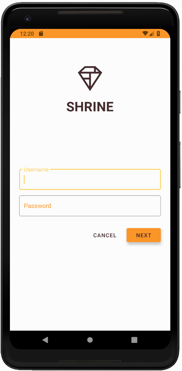
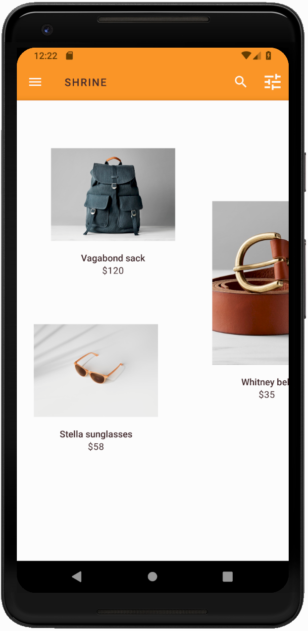
رنگ یک راه قدرتمند برای بیان برند شما است و یک تغییر کوچک در رنگ می تواند تأثیر زیادی بر تجربه کاربری شما داشته باشد. برای آزمایش این موضوع، بیایید ببینیم اگر طرح رنگ برند کاملاً متفاوت بود، Shrine چگونه به نظر می رسید.
سبک ها و رنگ ها را تغییر دهید
در styles.xml ، تم جدید زیر را اضافه کنید:
styles.xml
<style name="Theme.Shrine.Autumn" parent="Theme.Shrine">
   <item name="colorPrimary">#FFCF44</item>
   <item name="colorPrimaryDark">#FD9725</item>
   <item name="colorAccent">#FD9725</item>
   <item name="colorOnPrimary">#FFFFFF</item>
   <item name="colorError">#FD9725</item>
</style>
و در AndroidManifest.xml ، از این تم جدید در برنامه خود استفاده کنید:
AndroidManifest.xml
<application
   android:allowBackup="true"
   android:icon="@mipmap/ic_launcher"
   android:label="@string/shr_app_name"
   android:roundIcon="@mipmap/ic_launcher_round"
   android:supportsRtl="true"
  android:name="com.google.codelabs.mdc.kotlin.shrine.application.ShrineApplication"
   android:theme="@style/Theme.Shrine.Autumn">
   <activity android:name=".MainActivity">
       <intent-filter>
           <action android:name="android.intent.action.MAIN" />

           <category android:name="android.intent.category.LAUNCHER" />
       </intent-filter>
   </activity>
</application>
رنگ آیکون نوار ابزار را در colors.xml مطابق شکل زیر تغییر دهید:
Colors.xml
<color name="toolbarIconColor">#FFFFFF</color>
سپس، ویژگی android:theme سبک نوار ابزار خود را طوری تنظیم کنید که به موضوع فعلی با استفاده از ویژگی "?theme" ارجاع دهد، نه اینکه آن را سخت کدنویسی کنید:
styles.xml
<style name="Widget.Shrine.Toolbar" parent="Widget.AppCompat.Toolbar">
   <item name="android:background">?attr/colorAccent</item>
   <item name="android:theme">?theme</item>
   <item name="popupTheme">@style/ThemeOverlay.AppCompat.Light</item>
   <item name="titleTextAppearance">@style/TextAppearance.Shrine.Toolbar</item>
</style>
سپس، رنگ متن اشاره را در فیلدهای متنی صفحه ورود روشن کنید. ویژگی android:textColorHint را به سبک فیلدهای متنی اضافه کنید:
styles.xml
<style name="Widget.Shrine.TextInputLayout" parent="Widget.MaterialComponents.TextInputLayout.OutlinedBox">
   <item name="hintTextAppearance">
@style/TextAppearance.Shrine.TextInputLayout.HintText
</item>
   <item name="android:paddingBottom">8dp</item>
   <item name="android:textColorHint">?attr/colorPrimaryDark</item>
</style>
بسازید و اجرا کنید. اکنون باید تم جدید برای پیش نمایش ظاهر شود.
قبل از رفتن به MDC-104، کد تغییر یافته در این بخش را برگردانید.
8. خلاصه کنید
در حال حاضر، شما برنامه ای ایجاد کرده اید که شبیه مشخصات طراحی طراح شما است.
مراحل بعدی
شما از اجزای MDC زیر استفاده کرده اید: تم، تایپوگرافی، و ارتفاع. می توانید اجزا و زیرسیستم های بیشتری را در [کتابخانه وب MDC] کاوش کنید.
اگر طراحی برنامه برنامه ریزی شده شما حاوی عناصری باشد که اجزایی در کتابخانه MDC ندارند چه؟ در MDC-104: Material Design Advanced Components ، به نحوه ایجاد اجزای سفارشی با استفاده از کتابخانه MDC برای دستیابی به ظاهری خاص خواهیم پرداخت.