
1. Введение
Material Components (MDC) помогают разработчикам реализовать Material Design. Созданный командой инженеров и UX-дизайнеров Google, MDC включает в себя десятки красивых и функциональных компонентов пользовательского интерфейса и доступен для Android, iOS, Интернета и Flutter.material.io/develop. |
В лабораторных работах MDC-101 и MDC-102 вы использовали Material Components (MDC) для создания основ приложения Shrine — приложения для электронной коммерции, которое продает одежду и товары для дома. Это приложение содержит пользовательский поток, который начинается с экрана входа в систему и переводит пользователя на главный экран, на котором отображаются продукты.
Недавнее расширение Material Design дает дизайнерам и разработчикам большую гибкость в представлении бренда своего продукта. Теперь вы можете использовать MDC, чтобы настроить Shrine и отразить его уникальный стиль как никогда.
Что ты построишь
В этой кодовой лаборатории вы настроите Shrine так, чтобы он отражал ее бренд, используя:
- Цвет
- Типография
- Высота
- Макет
Компоненты и подсистемы MDC Android, используемые в этой лаборатории кода.
- Темы
- Типография
- Высота
Что вам понадобится
- Базовые знания Android-разработки.
- Android Studio (скачайте здесь , если у вас его еще нет)
- Эмулятор Android или устройство (доступно через Android Studio).
- Пример кода (см. следующий шаг)
Как бы вы оценили свой опыт создания приложений для Android?
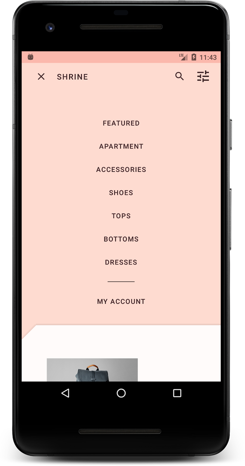
2. Настройте среду разработки
Продолжаем MDC-102?
Если вы прошли MDC-102, ваш код должен быть готов к использованию в этой лаборатории. Перейдите к шагу 3: Измените цвет .
Загрузите начальное приложение Codelab.
Стартовое приложение находится в каталоге material-components-android-codelabs-103-starter/java . Прежде чем начать, обязательно cd в этот каталог.
...или клонируйте его с GitHub
Чтобы клонировать эту кодовую лабораторию из GitHub, выполните следующие команды:
git clone https://github.com/material-components/material-components-android-codelabs
cd material-components-android-codelabs/
git checkout 103-starter
Загрузите стартовый код в Android Studio.
- После завершения работы мастера установки и появления окна «Добро пожаловать в Android Studio» нажмите « Открыть существующий проект Android Studio» . Перейдите в каталог, в который вы установили пример кода, и выберите java -> shrine (или найдите на своем компьютере shrine ), чтобы открыть проект Shrine.
- Подождите, пока Android Studio создаст и синхронизирует проект, как показывают индикаторы активности в нижней части окна Android Studio.
- На этом этапе Android Studio может вызвать некоторые ошибки сборки, поскольку вам не хватает Android SDK или инструментов сборки, таких как показанный ниже. Следуйте инструкциям в Android Studio, чтобы установить/обновить их и синхронизировать проект.

Добавить зависимости проекта
Проекту нужна зависимость от библиотеки поддержки Android MDC . В загруженном вами примере кода эта зависимость уже должна быть указана, но чтобы убедиться в этом, рекомендуется выполнить следующие шаги.
- Перейдите к файлу
build.gradleмодуляappи убедитесь, что блокdependenciesвключает зависимость от MDC Android:
api 'com.google.android.material:material:1.1.0-alpha06'
- (Необязательно) При необходимости отредактируйте файл
build.gradle, добавив следующие зависимости и синхронизировав проект.
dependencies {
    api 'com.google.android.material:material:1.1.0-alpha06'
    implementation 'androidx.legacy:legacy-support-v4:1.0.0'
    implementation 'com.android.volley:volley:1.1.1'
    implementation 'com.google.code.gson:gson:2.8.5'
    implementation "org.jetbrains.kotlin:kotlin-stdlib-jdk7:1.3.21"
    testImplementation 'junit:junit:4.12'
    androidTestImplementation 'androidx.test:core:1.1.0'
    androidTestImplementation 'androidx.test.ext:junit:1.1.0'
    androidTestImplementation 'androidx.test:runner:1.2.0-alpha05'
    androidTestImplementation 'androidx.test.espresso:espresso-core:3.2.0-alpha05'
}
Запустите стартовое приложение
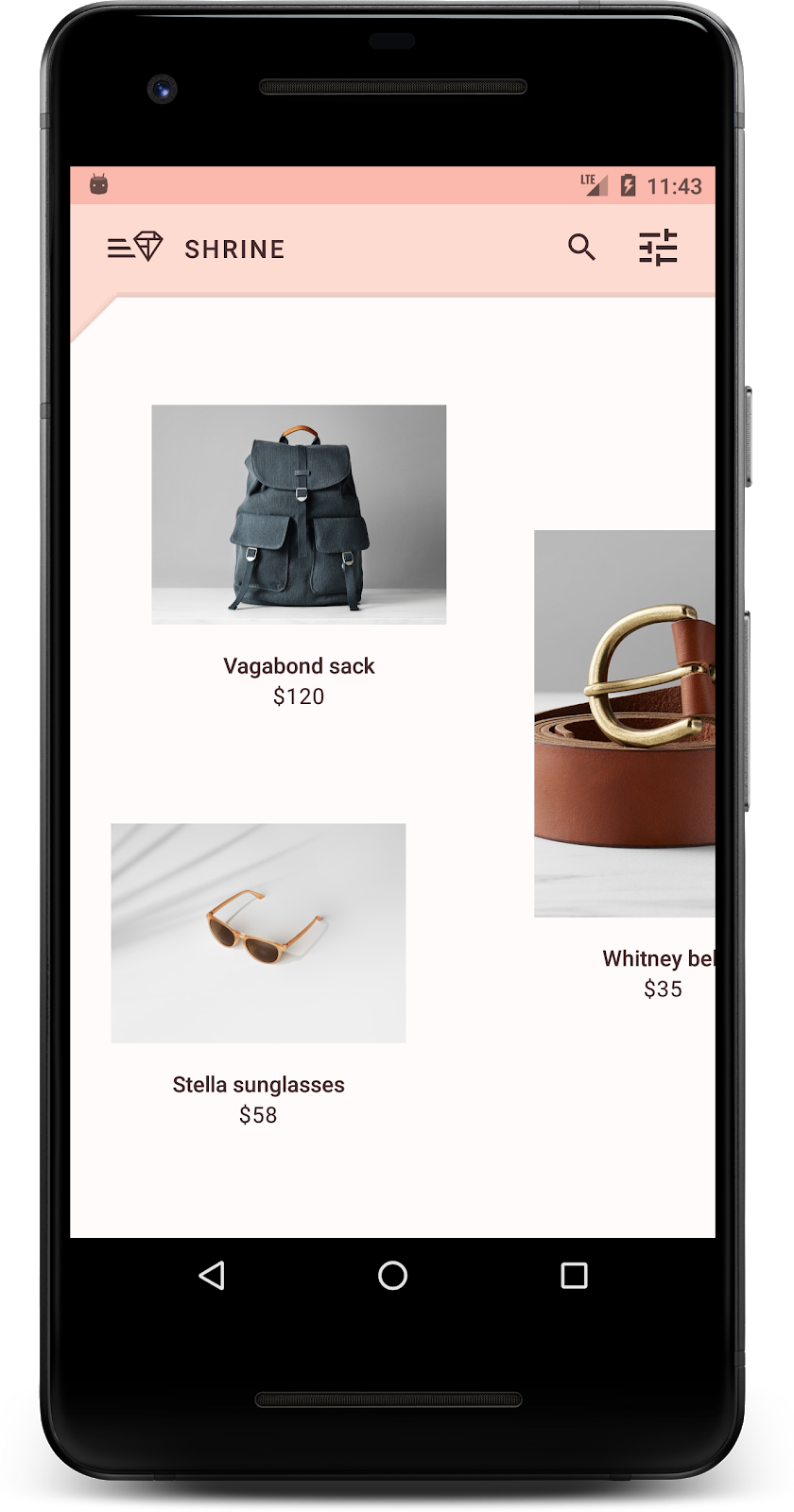
|

Успех! Вы должны увидеть страницу входа в Shrine, работающую на вашем устройстве или в эмуляторе. Когда вы нажмете «Далее», появится домашняя страница Shrine с панелью приложений вверху и сеткой изображений продуктов внизу.
Давайте сделаем верхнюю панель приложения соответствующей бренду Shrine, изменив ее цвет, высоту и типографику.
3. Измените цвет
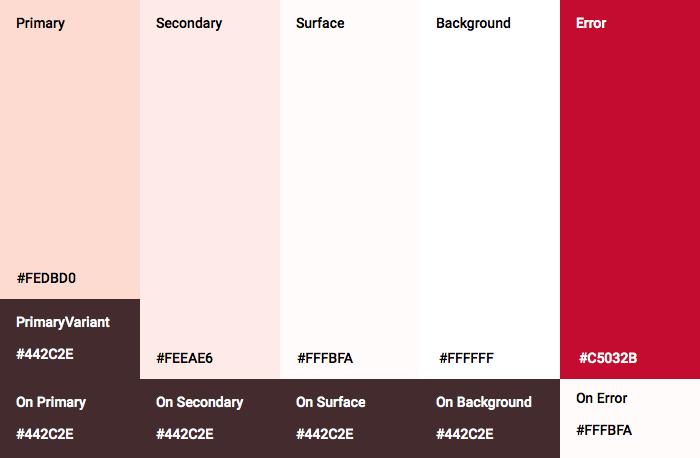
Эта цветовая тема была создана дизайнером с использованием нестандартных цветов (показано на изображении ниже). Он содержит цвета, выбранные из бренда Shrine и примененные к редактору тем материалов, который расширил их для создания более полной палитры. (Эти цвета не входят в цветовую палитру Material 2014 года .)
Редактор тем материалов сгруппировал их по оттенкам с числовой маркировкой, включая метки от 50, 100, 200 до 900 каждого цвета. Shrine использует только оттенки 50, 100 и 300 из розового образца и 900 из коричневого.

Давайте изменим цвет верхней панели приложения, чтобы он соответствовал этой цветовой схеме.
Установите colorPrimaryDark и colorAccent
В colors.xml измените следующие строки. Атрибут colorAccent среди прочего, управляет цветом верхней панели приложения, а атрибут colorPrimaryDark управляет цветом строки состояния.
цвета.xml
<color name="colorPrimaryDark">#FBB8AC</color>
<color name="colorAccent">#FEDBD0</color>
Чтобы использовать темные значки в строке состояния, добавьте следующее в Theme.Shrine , тему приложения Shrine:
стили.xml
<item name="android:windowLightStatusBar" tools:targetApi="m">true</item>
Ваши colors.xml и styles.xml должны выглядеть следующим образом:
цвета.xml
<?xml version="1.0" encoding="utf-8"?>
<resources>
   <color name="colorPrimary">#E0E0E0</color>
   <color name="colorPrimaryDark">#FBB8AC</color>
   <color name="colorAccent">#FEDBD0</color>
   <color name="toolbarIconColor">#FFFFFF</color>
   <color name="loginPageBackgroundColor">#FFFFFF</color>
   <color name="productGridBackgroundColor">#FFFFFF</color>
</resources>
стили.xml
<resources xmlns:android="http://schemas.android.com/tools">

   <!-- Base application theme. -->
   <style name="Theme.Shrine" parent="Theme.MaterialComponents.Light.NoActionBar">
       <!-- Customize your theme here. -->
       <item name="colorPrimary">@color/colorPrimary</item>
       <item name="colorPrimaryDark">@color/colorPrimaryDark</item>
       <item name="colorAccent">@color/colorAccent</item>
       <item name="android:windowLightStatusBar" tools:targetApi="m">true</item>
   </style>

   <style name="Widget.Shrine.Toolbar" parent="Widget.AppCompat.Toolbar">
       <item name="android:background">?attr/colorAccent</item>
       <item name="android:theme">@style/ThemeOverlay.AppCompat.Dark.ActionBar</item>
       <item name="popupTheme">@style/ThemeOverlay.AppCompat.Light</item>
   </style>

</resources>
В colors.xml добавьте новый ресурс цвета textColorPrimary со значением #442C2E и обновите toolbarIconColor , чтобы он ссылался на цвет textColorPrimary .
Обновите файл styles.xml , чтобы установить для атрибута android:textColorPrimary цвет textColorPrimary .
Установка android:textColorPrimary в Theme.Shrine будет стилизовать текст для всех элементов, включая верхнюю панель приложения и значки на нашей верхней панели приложения.
И еще: установите для атрибута android:theme в стиле Widget.Shrine.Toolbar значение Theme.Shrine .
Ваши colors.xml и styles.xml должны выглядеть следующим образом:
цвета.xml
<?xml version="1.0" encoding="utf-8"?>
<resources>
   <color name="colorPrimary">#E0E0E0</color>
   <color name="colorPrimaryDark">#FBB8AC</color>
   <color name="colorAccent">#FEDBD0</color>
   <color name="textColorPrimary">#442C2E</color>
   <color name="toolbarIconColor">@color/textColorPrimary</color>
   <color name="loginPageBackgroundColor">#FFFFFF</color>
   <color name="productGridBackgroundColor">#FFFFFF</color>
</resources>
стили.xml
<resources xmlns:android="http://schemas.android.com/tools">

   <!-- Base application theme. -->
   <style name="Theme.Shrine" parent="Theme.MaterialComponents.Light.NoActionBar">
       <!-- Customize your theme here. -->
       <item name="colorPrimary">@color/colorPrimary</item>
       <item name="colorPrimaryDark">@color/colorPrimaryDark</item>
       <item name="colorAccent">@color/colorAccent</item>
       <item name="android:windowLightStatusBar" tools:targetApi="m">true</item>
       <item name="android:textColorPrimary">@color/textColorPrimary</item>
   </style>

   <style name="Widget.Shrine.Toolbar" parent="Widget.AppCompat.Toolbar">
       <item name="android:background">?attr/colorAccent</item>
       <item name="android:theme">@style/Theme.Shrine</item>
       <item name="popupTheme">@style/ThemeOverlay.AppCompat.Light</item>
   </style>

</resources>
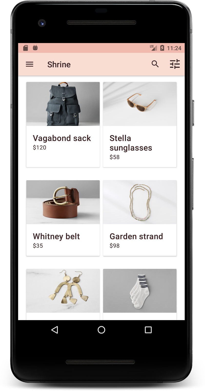
Стройте и запускайте. Ваша сетка продуктов теперь должна выглядеть так:
Давайте изменим стиль экрана входа в систему, чтобы он соответствовал нашей цветовой схеме.
Оформление текстовых полей
Давайте изменим текстовые поля на странице входа, чтобы они были контурными, и будем использовать лучшие цвета для нашего макета.
Добавьте следующий цветовой ресурс в файл colors.xml :
цвета.xml
<color name="textInputOutlineColor">#FBB8AC</color>
Добавьте два новых стиля в ваш styles.xml :
стили.xml
<style name="Widget.Shrine.TextInputLayout" parent="Widget.MaterialComponents.TextInputLayout.OutlinedBox">
   <item name="hintTextAppearance">@style/TextAppearance.Shrine.TextInputLayout.HintText</item>
   <item name="hintTextColor">@color/textColorPrimary</item>
   <item name="android:paddingBottom">8dp</item>
   <item name="boxStrokeColor">@color/textInputOutlineColor</item>
</style>

<style name="TextAppearance.Shrine.TextInputLayout.HintText" parent="TextAppearance.MaterialComponents.Subtitle2">
   <item name="android:textColor">?android:attr/textColorPrimary</item>
</style>
Наконец, установите для атрибута стиля обоих XML-компонентов TextInputLayout в shr_login_fragment.xml новый стиль:
shr_login_fragment.xml
<com.google.android.material.textfield.TextInputLayout
   style="@style/Widget.Shrine.TextInputLayout"
   android:layout_width="match_parent"
   android:layout_height="wrap_content"
   android:hint="@string/shr_hint_username">

   <com.google.android.material.textfield.TextInputEditText
       android:layout_width="match_parent"
       android:layout_height="wrap_content"
       android:inputType="text"
       android:maxLines="1" />
</com.google.android.material.textfield.TextInputLayout>

<com.google.android.material.textfield.TextInputLayout
   android:id="@+id/password_text_input"
   style="@style/Widget.Shrine.TextInputLayout"
   android:layout_width="match_parent"
   android:layout_height="wrap_content"
   android:hint="@string/shr_hint_password"
   app:errorEnabled="true">

   <com.google.android.material.textfield.TextInputEditText
       android:id="@+id/password_edit_text"
       android:layout_width="match_parent"
       android:layout_height="wrap_content"
       android:inputType="textPassword" />
</com.google.android.material.textfield.TextInputLayout>
Стилизовать цвета кнопок
Наконец, настройте цвета кнопок на странице входа. Добавьте следующие стили в ваш styles.xml :
стили.xml
<style name="Widget.Shrine.Button" parent="Widget.MaterialComponents.Button">
   <item name="android:textColor">?android:attr/textColorPrimary</item>
   <item name="backgroundTint">?attr/colorPrimaryDark</item>
</style>

<style name="Widget.Shrine.Button.TextButton" parent="Widget.MaterialComponents.Button.TextButton">
   <item name="android:textColor">?android:attr/textColorPrimary</item>
</style>
Стиль Widget.Shrine.Button является продолжением стиля MaterialButton по умолчанию и изменяет цвет текста и оттенок фона кнопки. Widget.Shrine.Button.TextButton является продолжением текстового стиля MaterialButton по умолчанию и меняет только цвет текста.
Установите стиль Widget.Shrine.Button для кнопки «Далее» и стиль Widget.Shrine.Button.TextButton для кнопки «Отмена» следующим образом:
shr_login_fragment.xml
<RelativeLayout
   android:layout_width="match_parent"
   android:layout_height="wrap_content">

   <com.google.android.material.button.MaterialButton
       android:id="@+id/next_button"
       style="@style/Widget.Shrine.Button"
       android:layout_width="wrap_content"
       android:layout_height="wrap_content"
       android:layout_alignParentEnd="true"
       android:layout_alignParentRight="true"
       android:text="@string/shr_button_next" />

   <com.google.android.material.button.MaterialButton
       android:id="@+id/cancel_button"
       style="@style/Widget.Shrine.Button.TextButton"
       android:layout_width="wrap_content"
       android:layout_height="wrap_content"
       android:layout_marginEnd="12dp"
       android:layout_marginRight="12dp"
       android:layout_toStartOf="@id/next_button"
       android:layout_toLeftOf="@id/next_button"
       android:text="@string/shr_button_cancel" />

</RelativeLayout>
Обновите цвет логотипа Shrine на странице входа. Это потребует небольшого изменения в векторном рисуемом файле shr_logo.xml . Откройте рисуемый файл и измените свойство android:fillAlpha на 1. Рисуемый файл должен выглядеть следующим образом:
shr_logo.xml
<vector xmlns:android="http://schemas.android.com/apk/res/android"
   android:width="149dp"
   android:height="152dp"
   android:tint="?attr/colorControlNormal"
   android:viewportWidth="149"
   android:viewportHeight="152">
   <path
       android:fillAlpha="1"
       android:fillColor="#DADCE0"
       android:fillType="evenOdd"
       android:pathData="M42.262,0L0,38.653L74.489,151.994L148.977,38.653L106.723,0M46.568,11.11L21.554,33.998L99.007,33.998L99.007,11.11L46.568,11.11ZM110.125,18.174L110.125,33.998L127.416,33.998L110.125,18.174ZM80.048,45.116L80.048,123.296L131.426,45.116L80.048,45.116ZM17.551,45.116L33.976,70.101L68.93,70.101L68.93,45.116L17.551,45.116ZM41.284,81.219L68.93,123.296L68.93,81.219L41.284,81.219Z"
       android:strokeWidth="1"
       android:strokeAlpha="0.4"
       android:strokeColor="#00000000" />
</vector>
Установите для атрибута android:tint логотипа <ImageView> в shr_login_fragment.xml значение ?android:attr/textColorPrimary следующим образом:
shr_login_fragment.xml
<ImageView
   android:layout_width="64dp"
   android:layout_height="64dp"
   android:layout_gravity="center_horizontal"
   android:layout_marginTop="48dp"
   android:layout_marginBottom="16dp"
   android:tint="?android:attr/textColorPrimary"
   app:srcCompat="@drawable/shr_logo" />
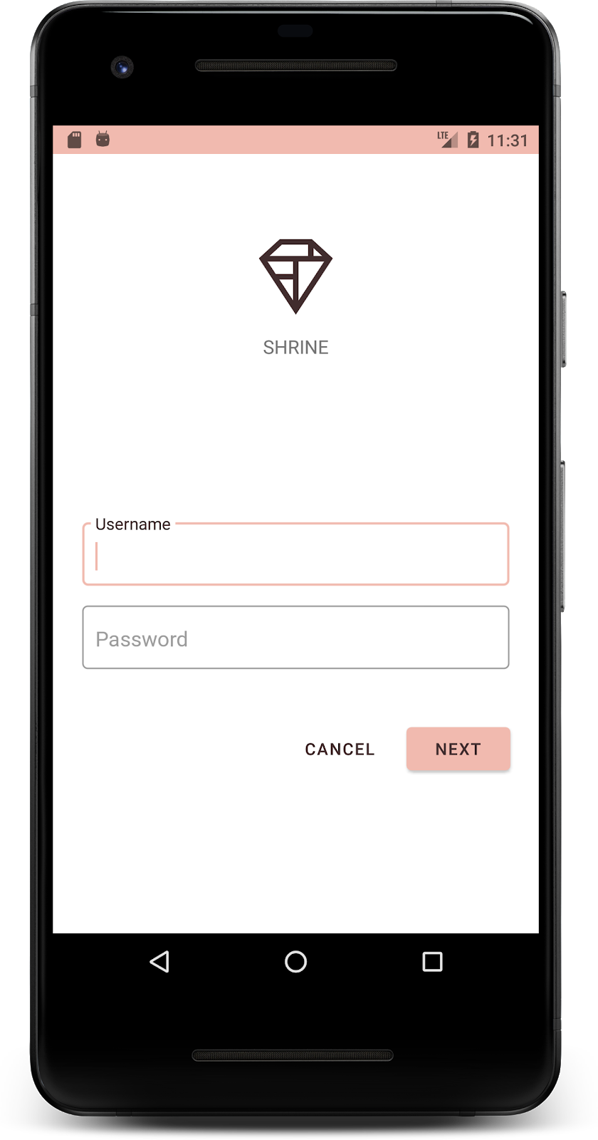
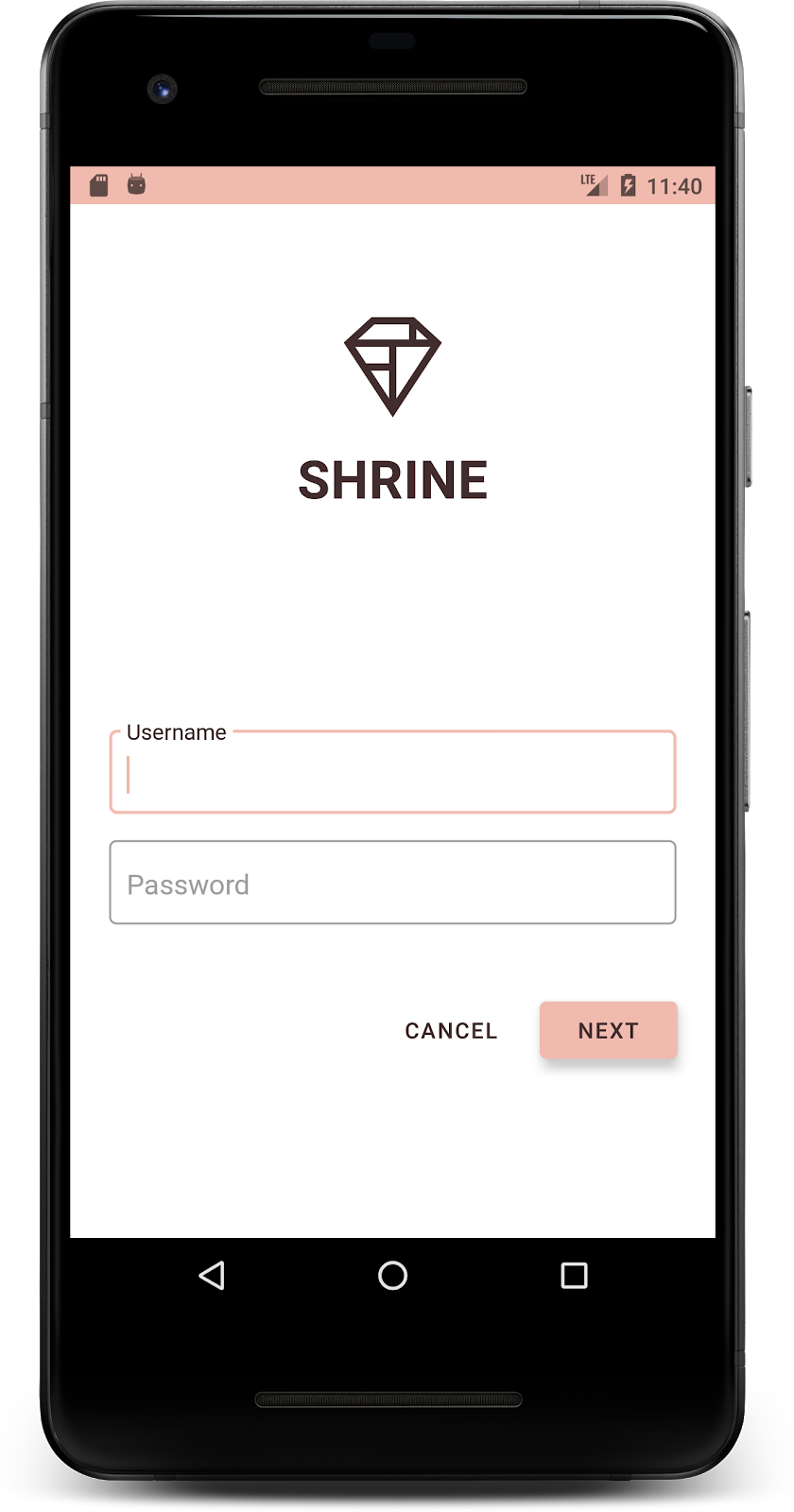
Стройте и запускайте. Теперь ваш экран входа в систему должен выглядеть так:
4. Измените типографику и стили меток.
Помимо изменения цвета ваш дизайнер также предоставил вам специальную типографику для использования на сайте. Давайте добавим это и в верхнюю панель приложения.
Оформление верхней панели приложений
Оформите внешний вид текста верхней панели приложения в соответствии со спецификациями, предоставленными вашим дизайнером. Добавьте следующий стиль оформления текста в styles.xml и установите свойство titleTextAppearance для ссылки на этот стиль в стиле Widget.Shrine.Toolbar .
стили.xml
<style name="Widget.Shrine.Toolbar" parent="Widget.AppCompat.Toolbar">
   <item name="android:background">?attr/colorAccent</item>
   <item name="android:theme">@style/Theme.Shrine</item>
   <item name="popupTheme">@style/ThemeOverlay.AppCompat.Light</item>
   <item name="titleTextAppearance">@style/TextAppearance.Shrine.Toolbar</item>
</style>

<style name="TextAppearance.Shrine.Toolbar" parent="TextAppearance.MaterialComponents.Button">
   <item name="android:textSize">16sp</item>
</style>
Ваши colors.xml и styles.xml должны выглядеть следующим образом:
цвета.xml
<?xml version="1.0" encoding="utf-8"?>
<resources>
   <color name="colorPrimary">#E0E0E0</color>
   <color name="colorPrimaryDark">#FBB8AC</color>
   <color name="colorAccent">#FEDBD0</color>
   <color name="textColorPrimary">#442C2E</color>
   <color name="toolbarIconColor">@color/textColorPrimary</color>
   <color name="loginPageBackgroundColor">#FFFFFF</color>
   <color name="productGridBackgroundColor">#FFFFFF</color>
   <color name="textInputOutlineColor">#FBB8AC</color>
</resources>
стили.xml
<resources xmlns:android="http://schemas.android.com/tools">

   <!-- Base application theme. -->
   <style name="Theme.Shrine" parent="Theme.MaterialComponents.Light.NoActionBar">
       <!-- Customize your theme here. -->
       <item name="colorPrimary">@color/colorPrimary</item>
       <item name="colorPrimaryDark">@color/colorPrimaryDark</item>
       <item name="colorAccent">@color/colorAccent</item>
       <item name="android:windowLightStatusBar" tools:targetApi="m">true</item>
       <item name="android:textColorPrimary">@color/textColorPrimary</item>
   </style>

   <style name="Widget.Shrine.TextInputLayout" parent="Widget.MaterialComponents.TextInputLayout.OutlinedBox">
       <item name="hintTextAppearance">@style/TextAppearance.Shrine.TextInputLayout.HintText</item>
       <item name="hintTextColor">@color/textColorPrimary</item>
       <item name="android:paddingBottom">8dp</item>
       <item name="boxStrokeColor">@color/textInputOutlineColor</item>
   </style>

   <style name="TextAppearance.Shrine.TextInputLayout.HintText" parent="TextAppearance.MaterialComponents.Subtitle2">
       <item name="android:textColor">?android:attr/textColorPrimary</item>
   </style>


   <style name="Widget.Shrine.Button" parent="Widget.MaterialComponents.Button">
       <item name="android:textColor">?android:attr/textColorPrimary</item>
       <item name="backgroundTint">?attr/colorPrimaryDark</item>
   </style>

   <style name="Widget.Shrine.Button.TextButton" parent="Widget.MaterialComponents.Button.TextButton">
       <item name="android:textColor">?android:attr/textColorPrimary</item>
   </style>

   <style name="Widget.Shrine.Toolbar" parent="Widget.AppCompat.Toolbar">
       <item name="android:background">?attr/colorAccent</item>
       <item name="android:theme">@style/Theme.Shrine</item>
       <item name="popupTheme">@style/ThemeOverlay.AppCompat.Light</item>
       <item name="titleTextAppearance">@style/TextAppearance.Shrine.Toolbar</item>
   </style>

   <style name="TextAppearance.Shrine.Toolbar" parent="TextAppearance.MaterialComponents.Button">
       <item name="android:textSize">16sp</item>
   </style>

</resources>
Стиль ярлыков
Мы настроим этикетки на карточках товаров так, чтобы текст выглядел правильно и располагался по центру карточки по горизонтали.
Обновите типографику на заголовке с textAppearanceHeadline6 на textAppearanceSubtitle2 следующим образом:
shr_product_card.xml
<TextView
   android:id="@+id/product_title"
   android:layout_width="match_parent"
   android:layout_height="wrap_content"
   android:text="@string/shr_product_title"
   android:textAppearance="?attr/textAppearanceSubtitle2" />
Чтобы центрировать метки изображений, измените метку <TextView> в shr_product_card.xml , установив атрибут android:textAlignment="center" :
shr_product_card.xml
<LinearLayout
   android:layout_width="match_parent"
   android:layout_height="wrap_content"
   android:orientation="vertical"
   android:padding="16dp">

   <TextView
       android:id="@+id/product_title"
       android:layout_width="match_parent"
       android:layout_height="wrap_content"
       android:text="@string/shr_product_title"
       android:textAlignment="center"
       android:textAppearance="?attr/textAppearanceSubtitle2" />

   <TextView
       android:id="@+id/product_price"
       android:layout_width="match_parent"
       android:layout_height="wrap_content"
       android:text="@string/shr_product_description"
       android:textAlignment="center"
       android:textAppearance="?attr/textAppearanceBody2" />
</LinearLayout>
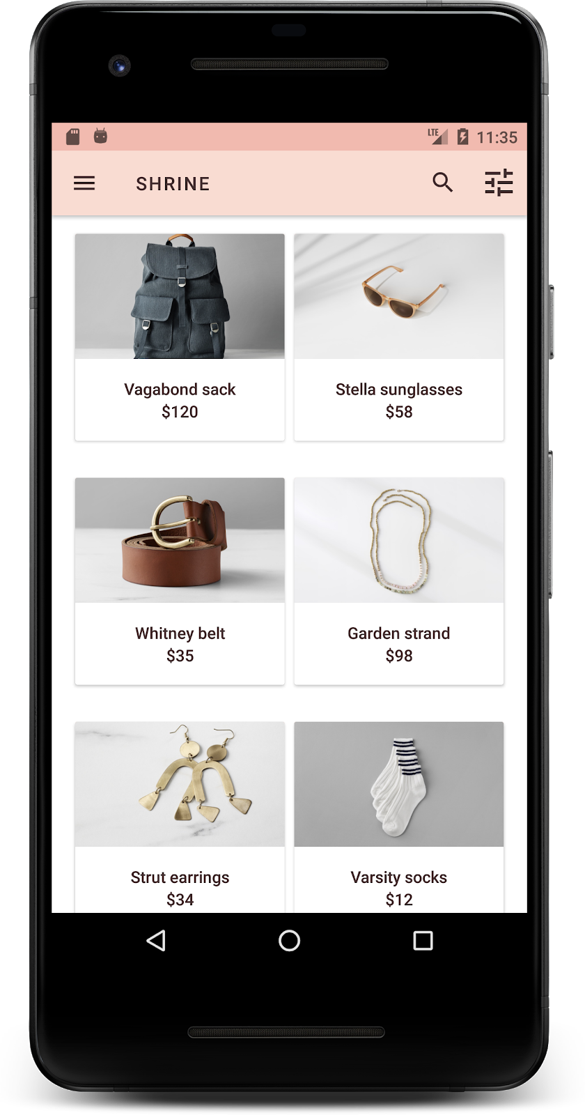
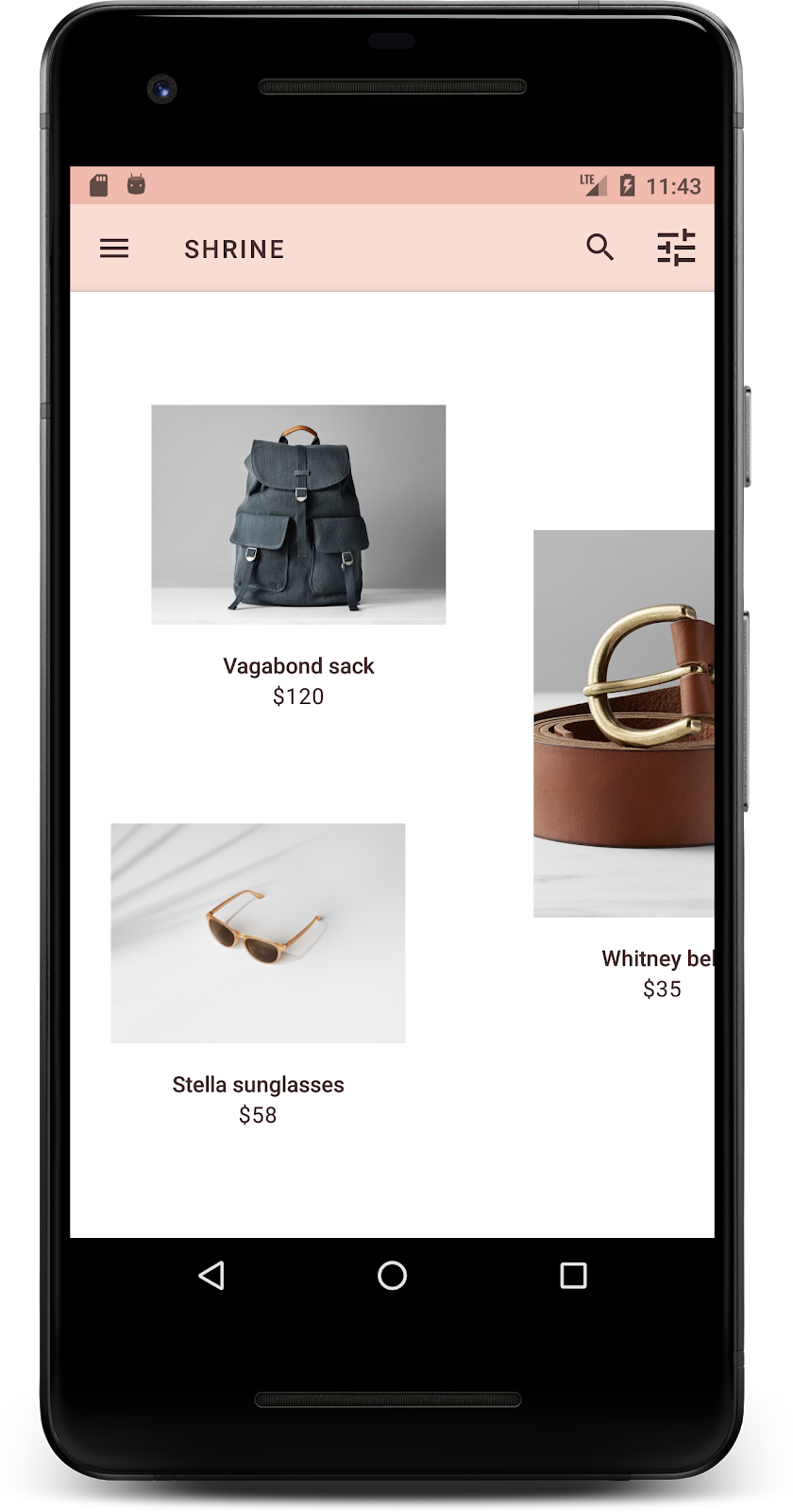
Стройте и запускайте. Экран сетки вашего продукта теперь должен выглядеть так:
Давайте изменим типографику экрана входа в систему, чтобы она соответствовала.
Измените шрифт экрана входа в систему
В styles.xml добавьте следующий стиль:
стили.xml
<style name="TextAppearance.Shrine.Title" parent="TextAppearance.MaterialComponents.Headline4">
   <item name="textAllCaps">true</item>
   <item name="android:textStyle">bold</item>
   <item name="android:textColor">?android:attr/textColorPrimary</item>
</style>
В shr_login_fragment.xml установите новый стиль для заголовка «SHRINE» <TextView> (и удалите имеющиеся атрибуты textAllCaps и textSize ):
shr_login_fragment.xml
<TextView
   android:layout_width="wrap_content"
   android:layout_height="wrap_content"
   android:layout_gravity="center_horizontal"
   android:layout_marginBottom="132dp"
   android:text="@string/shr_app_name"
   android:textAppearance="@style/TextAppearance.Shrine.Title" />
Стройте и запускайте. Теперь ваш экран входа в систему должен выглядеть так:

5. Отрегулируйте высоту
Теперь, когда вы придали странице особый цвет и типографику, соответствующую Shrine, давайте взглянем на карточки, на которых изображена продукция Shrine. Прямо сейчас они расположены на белой поверхности под навигацией приложения. Давайте уделим продуктам больше внимания, чтобы привлечь к ним внимание.
Изменить высоту сетки продуктов
Давайте изменим высоту верхней панели приложения и содержимого так, чтобы содержимое выглядело так, будто содержимое находится на листе, плавающем над верхней панелью приложения. Добавьте атрибут app:elevation в свой AppBarLayout и android:elevation в свои XML-компоненты NestedScrollView в shr_product_grid_fragment.xml следующим образом:
shr_product_grid_fragment.xml
<com.google.android.material.appbar.AppBarLayout
   android:layout_width="match_parent"
   android:layout_height="wrap_content"
   app:elevation="0dp">

   <androidx.appcompat.widget.Toolbar
       android:id="@+id/app_bar"
       style="@style/Widget.Shrine.Toolbar"
       android:layout_width="match_parent"
       android:layout_height="?attr/actionBarSize"
       app:navigationIcon="@drawable/shr_menu"
       app:title="@string/shr_app_name" />
</com.google.android.material.appbar.AppBarLayout>

<androidx.core.widget.NestedScrollView
   android:layout_width="match_parent"
   android:layout_height="match_parent"
   android:layout_marginTop="56dp"
   android:background="@color/productGridBackgroundColor"
   android:elevation="8dp"
   android:paddingStart="@dimen/shr_product_grid_spacing"
   android:paddingEnd="@dimen/shr_product_grid_spacing"
   app:layout_behavior="@string/appbar_scrolling_view_behavior">

   <androidx.appcompat.app.AlertController.RecycleListView
       android:id="@+id/recycler_view"
       android:layout_width="match_parent"
       android:layout_height="match_parent" />

</androidx.core.widget.NestedScrollView>
Изменить высоту карты (и цвет)
Вы можете настроить высоту каждой карточки, изменив app:cardElevation в shr_product_card.xml с 2dp на 0dp . Также измените app:cardBackgroundColor на @android:color/transparent .
shr_product_card.xml
<com.google.material.card.MaterialCardView xmlns:android="http://schemas.android.com/apk/res/android"
   xmlns:app="http://schemas.android.com/apk/res-auto"
   android:layout_width="match_parent"
   android:layout_height="wrap_content"
   app:cardBackgroundColor="@android:color/transparent"
   app:cardElevation="0dp"
   app:cardPreventCornerOverlap="true">
Взгляните! Вы настроили высоту каждой карточки на странице сетки товаров.

Изменение высоты кнопки «Далее»
В styles.xml добавьте следующее свойство в свой стиль Widget.Shrine.Button :
стили.xml
<item name="android:stateListAnimator" tools:ignore="NewApi">
    @animator/shr_next_button_state_list_anim
</item>
Установка android:stateListAnimator в стиле Button позволяет кнопке «Далее» использовать предоставленный нами аниматор.
Стройте и запускайте. Теперь ваш экран входа в систему должен выглядеть так:
6. Измените макет
Измените макет, чтобы отображать карточки с разными пропорциями и размерами, чтобы каждая карточка выглядела уникально по сравнению с другими.
Используйте шахматный адаптер RecyclerView.
Мы предоставили новый адаптер RecyclerView в пакете staggeredgridlayout , который отображает асимметричный макет карты в шахматном порядке, предназначенный для горизонтальной прокрутки. Вы можете самостоятельно покопаться в этом коде, но мы не будем здесь рассматривать, как он реализован.
Чтобы использовать этот новый адаптер, измените метод onCreateView() в ProductGridFragment.java . Замените блок кода после комментария «setup the RecyclerView » следующим:
ПродуктГридФрагмент.java
// Set up the RecyclerView
RecyclerView recyclerView = view.findViewById(R.id.recycler_view);
recyclerView.setHasFixedSize(true);
GridLayoutManager gridLayoutManager = new GridLayoutManager(getContext(), 2, GridLayoutManager.HORIZONTAL, false);
gridLayoutManager.setSpanSizeLookup(new GridLayoutManager.SpanSizeLookup() {
   @Override
   public int getSpanSize(int position) {
       return position % 3 == 2 ? 2 : 1;
   }
});
recyclerView.setLayoutManager(gridLayoutManager);
StaggeredProductCardRecyclerViewAdapter adapter = new StaggeredProductCardRecyclerViewAdapter(
       ProductEntry.initProductEntryList(getResources()));
recyclerView.setAdapter(adapter);
int largePadding = getResources().getDimensionPixelSize(R.dimen.shr_staggered_product_grid_spacing_large);
int smallPadding = getResources().getDimensionPixelSize(R.dimen.shr_staggered_product_grid_spacing_small);
recyclerView.addItemDecoration(new ProductGridItemDecoration(largePadding, smallPadding));
Нам также необходимо внести небольшие изменения в наш product_grid_fragment.xml , чтобы удалить отступы из нашего NestedScrollView , как показано ниже:
shr_product_grid_fragment.xml
<androidx.core.widget.NestedScrollView
   android:layout_width="match_parent"
   android:layout_height="match_parent"
   android:layout_marginTop="56dp"
   android:background="@color/productGridBackgroundColor"
   app:layout_behavior="@string/appbar_scrolling_view_behavior"
   android:elevation="6dp">
Наконец, мы также настроим заполнение нашей карточки в RecyclerView , изменив ProductGridItemDecoration.java . Измените метод getItemOffsets() файла ProductGridItemDecoration.java следующим образом:
ПродуктGridItemDecoration.java
@Override
public void getItemOffsets(Rect outRect, View view,
                          RecyclerView parent, RecyclerView.State state) {
   outRect.left = smallPadding;
   outRect.right = largePadding;
}
Стройте и запускайте. Элементы сетки продуктов теперь должны располагаться в шахматном порядке:
7. Попробуйте другую тему
Цвет — это мощный способ выразить ваш бренд, и небольшое изменение цвета может оказать большое влияние на ваш пользовательский опыт. Чтобы проверить это, давайте посмотрим, как бы выглядел Shrine, если бы цветовая гамма бренда была совершенно другой.
Изменение стилей и цветов
В styles.xml добавьте следующую новую тему:
стили.xml
<style name="Theme.Shrine.Autumn" parent="Theme.Shrine">
   <item name="colorPrimary">#FFCF44</item>
   <item name="colorPrimaryDark">#FD9725</item>
   <item name="colorAccent">#FD9725</item>
   <item name="colorOnPrimary">#FFFFFF</item>
   <item name="colorError">#FD9725</item>
</style>
А в AndroidManifest.xml используйте эту новую тему в своем приложении:
AndroidManifest.xml
<application
   android:allowBackup="true"
   android:icon="@mipmap/ic_launcher"
   android:label="@string/shr_app_name"
   android:roundIcon="@mipmap/ic_launcher_round"
   android:supportsRtl="true"
   android:name="com.google.codelabs.mdc.java.shrine.application.ShrineApplication"
   android:theme="@style/Theme.Shrine.Autumn">
   <activity android:name=".MainActivity">
       <intent-filter>
           <action android:name="android.intent.action.MAIN" />

           <category android:name="android.intent.category.LAUNCHER" />
       </intent-filter>
   </activity>
</application>
Измените цвет значка панели инструментов в colors.xml , как показано ниже:
цвета.xml
<color name="toolbarIconColor">#FFFFFF</color>
Затем установите атрибут android:theme нашего стиля панели инструментов, чтобы он ссылался на текущую тему с помощью атрибута «?theme», а не жестко ее кодировал:
стили.xml
<style name="Widget.Shrine.Toolbar" parent="Widget.AppCompat.Toolbar">
   <item name="android:background">?attr/colorAccent</item>
   <item name="android:theme">?theme</item>
   <item name="popupTheme">@style/ThemeOverlay.AppCompat.Light</item>
   <item name="titleTextAppearance">@style/TextAppearance.Shrine.Toolbar</item>
</style>
Затем осветлите цвет текста подсказки в текстовых полях экрана входа в систему. Добавьте атрибут android:textColorHint в стиль текстовых полей:
стили.xml
<style name="Widget.Shrine.TextInputLayout" parent="Widget.MaterialComponents.TextInputLayout.OutlinedBox">
   <item name="hintTextAppearance">
@style/TextAppearance.Shrine.TextInputLayout.HintText
</item>
   <item name="android:paddingBottom">8dp</item>
   <item name="android:textColorHint">?attr/colorPrimaryDark</item>
</style>
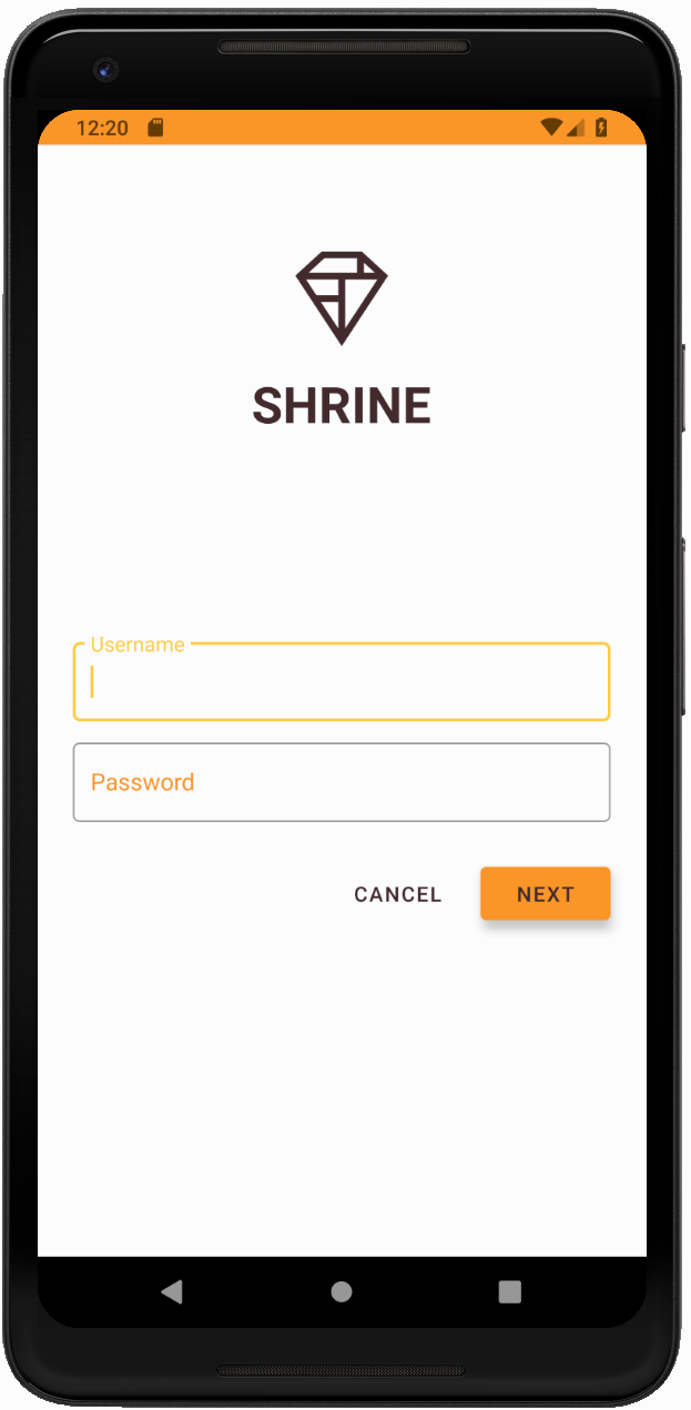
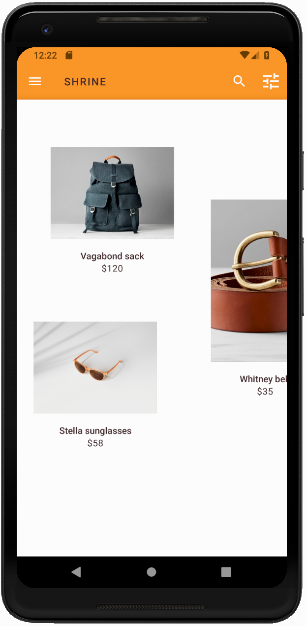
Стройте и запускайте. Новая тема теперь должна появиться для предварительного просмотра.
Прежде чем перейти к MDC-104, верните код, измененный в этом разделе.
8. Резюме
К этому моменту вы создали приложение, которое соответствует спецификациям вашего дизайнера.
Следующие шаги
Вы использовали следующие компоненты MDC: тему, типографику и высоту. Вы можете изучить еще больше компонентов в каталоге компонентов MDC-Android в MDC Android .
Что делать, если планируемый дизайн приложения содержит элементы, у которых нет компонентов в библиотеке MDC? В MDC-104: Расширенные компоненты Material Design мы рассмотрим, как создавать пользовательские компоненты с использованием библиотеки MDC для достижения определенного внешнего вида.